
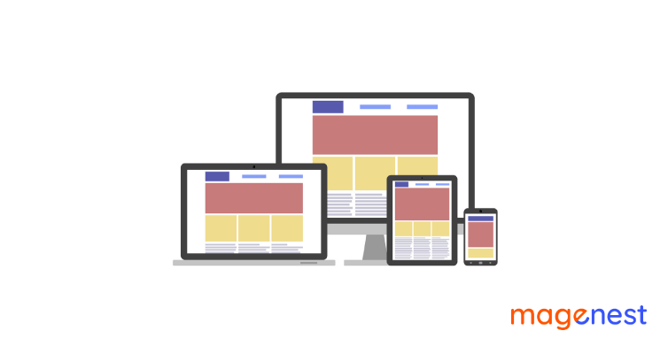
Table of Contents
In today's UX design world, responsive design is a big deal. Everyone in the business knows that a truly responsive design equals good usability. But what is responsive web design exactly, and how does it work?
Keep reading to learn more about the term "responsive," which is sometimes misunderstood, and to see effective practices of responsive web design! Don't skip the real-life example part since it will provide you with powerful weapons to start on your own.
What is Responsive Design?
On average, people spend 3.3 hours per day on their smartphones interacting with digital media. Because of this shift in consumer behavior, having a website that only works on a desktop computer is no longer effective.
Responsive design is a graphic user interface (GUI) design approach for creating content that adapts to different screen sizes without losing its quality. Designers use relative units (%) and media queries to maintain content consistency across devices by automatically adapting their designs to the browser space.

In a nutshell, a responsive web design adapts to various screen sizes and viewports automatically. A responsive website allows visitors to view it on any device and it will still look and function properly.
Your website (and its pages) can now adjust and provide the best experience to consumers, whether they're on a desktop, laptop, tablet, or even smartphone, thanks to responsive website design. Your website, however, must be responsive in order to make that happen.
How Responsive Websites Work?
A typical website is made up of a collection of files (each web page, such as the home page or the about page, is a separate file). HTML code and content are included in each file (text and images). Cascading Style Sheets (CSS) files are used to style web pages (CSS).
Let's assume that a conventional (non-responsive) website consists of a set of files plus a few CSS files that determine the site's look. Depending on the device being used to access the website, a responsive website design uses a different set of CSS files to look and respond differently.
For example, a desktop user will see a horizontally oriented navigation menu, whereas a mobile user will see a vertically aligned navigation bar with larger text that is easily readable on a smaller screen.
There are some very important key responsive web design characteristics that a responsive web design agency adheres to when designing a mobile-compatible website. These include:
- A Flexible Grid System: This is an intuitive, responsive Cascading Style Sheets (CSS) grid system with 24 columns that feature browser support.
- Flexible Images: also known as adaptable images. For mobile websites, sizing considerations that would not be required for images to look appropriately on a fixed display size becomes important.
- Media Queries: This is a module that allows content to be adjusted to fit the screen resolution.
A responsive website development firm may use responsive web design testing to ensure that users get the greatest possible browsing experience by leveraging these characteristics.
Why is it Important to be Responsive?
In many ways, the rise of responsive design is related to the proliferation of mobile devices. Users could suddenly go from a laptop-sized screen to a smartphone-sized screen. Within the next few years, users will expect to be able to visit any website from a wide range of mobile devices. Designers could no longer overlook the importance of mobile devices, especially with billions of them in use worldwide.
The rise of Google is also linked to the proliferation of smartphones. Even if you lived under a rock, you'd probably use Google to discover information on a daily basis. Google is how users will discover a product on any particular website – especially if you need a large number of them to find it. This takes us to the second point that contributes to responsiveness: Google's mobile-first indexing.

It might be complicated to understand the role of SEO in UX design, especially when it comes to content optimization. In broad strokes, Google's determination to prioritize mobile design is a message to any new website that the mobile version will have the most effect on the product's ranking. In a nutshell, if there is no responsive mobile website, there will be no front-page ranking for any search.
Here's a brief list of Google's recommendations for enhancing your responsive design:
- Continue to use the same content for web and mobile. This includes maintaining the content's titles, headings, and overall structure.
- Make use of the same metadata for web and mobile.
- Provide high-quality visual content. We're talking about large images in the right format, with the same title, filename, and alt text.
- The thing is that if you devote time and effort to your responsive design, you will most likely fulfill all of these requirements. Many of these factors also lead to a better user experience, allowing the brand to provide users with a consistent experience.
Characteristics of Responsive Website Design
Right. Now that we understand why responsive design is so important, let's look at some of the characteristics that constitute responsive website design.

1. CSS breakpoints
CSS breakpoints are a basic feature of responsive websites. According to the screen size, their duty is to "split" the design into a smaller website version. Breakpoints often have a minimum and maximum width that determine which version of the design users may view.
However, how many breakpoints does a website require to be truly responsive? If the device does not fit the minimum or maximum width, the website design will still look odd, which contradicts the purpose of creating a responsive design.
There are at least three key breakpoints to cover the devices that most users prefer - from desktops to smartphones to tablets. Many designers also add "minor" breakpoints, where the content adapts automatically to retain the design's visual balance but does not adjust much. This includes changing the font size but not the overall structure.
2. Optimized visuals
Images, whether a high-resolution photograph or a creative illustration, are extremely important on any website. Some designers believe in cropping images so that visitors only see a part of them on smaller displays, maintaining the visual impact. However, we believe that using vector images is the best way.
This refers to the ability to adjust the size of an image without degrading the visual quality. This also remains true for the typography on the page. Instead of using images with text, it is better to use genuine text so that the website may change size according to the screen without affecting font quality.
3. Careful mobile design
For many design teams, starting with the smallest screen is the best way to go. This is mostly due to the fact that by prioritizing mobile design, teams may have a complete idea of where the content needs to go.
When it comes to responsive design, it's all about focusing on the content rather than the overall appearance. As a result, by developing the mobile version first, we can focus on the important content that we need to present from the start — the bits that the user definitely needs. From there, we can either add additional data and content as we get to larger screens, or we can discover better methods to present that key content.
General Best Practices of Responsive Web Design
The features we've previously highlighted are compatible with the majority of responsive designs on the market. In principle, prototyping a responsive website may appear simple, but there are several things to consider. Let's go through some general guidelines for designing websites that users will enjoy, regardless of device.
#1 Consider your visual hierarchy
This relates to why many designers want to begin with the smallest screen resolution available. It's not only about recognizing which parts of your content are critical; it's also about knowing how to display them in the best way possible.
The visual structure of the website may need to change as we move through the breakpoints, but its essence should remain the same. It must adapt in the sense that when the size of the screen changes, so must the components in order for the product to remain usable. This also helps Google's crawler by indicating that your product provides a consistent experience on both mobile and web.
#2 The size of the buttons is critical
When it comes to web-based products, buttons may be rather simple. That is, a cursor is an accurate tool that almost anybody can use, but our fingers are not. The size of the finger in question may vary from user to user, and designers must take into account the limited area on a mobile device.
In addition to that potential issue, buttons must be informative and provide as much context as possible. This includes utilizing a carefully selected microcopy and the appropriate color for your key buttons, especially in mobile designs.
#3 Place navigation as a top priority
If you rely on a navigation bar to access information, you'll need to properly prioritize it in the mobile design. Aspects of the product, such as navigation design, are important and must be properly considered in responsive websites. As the device's screen decreases in size, there will be less and less area for that navigation bar.
It is critical to ask questions such as, "When do we hide the navigation options?" Do we keep them all hidden? Which ones are we going to hide first?
More often than not, products will need to hide everything behind a button, similar to the hamburger menus we've all been used to seeing on mobile webpages. While a hamburger menu is not the only option, there is no disputing that the whole navigation menu will need to be hidden in smartphones.
This is all about identifying the most essential pages in the entire product and ensuring that customers can discover them regardless of the device they are using. Prioritization is usually more effective when done early in the design process, so if we start with the mobile design we’ll already have the important bits that need to be included.
Responsive Website Design Examples From Renowned Brands
To put UX/UI design into perspective, see some of the greatest examples of websites developed using the responsive design approach.
These examples will highlight the distinction between desktop and mobile versions of websites, as well as the importance of having fluid grids and flexible images that adapt to various screen sizes.
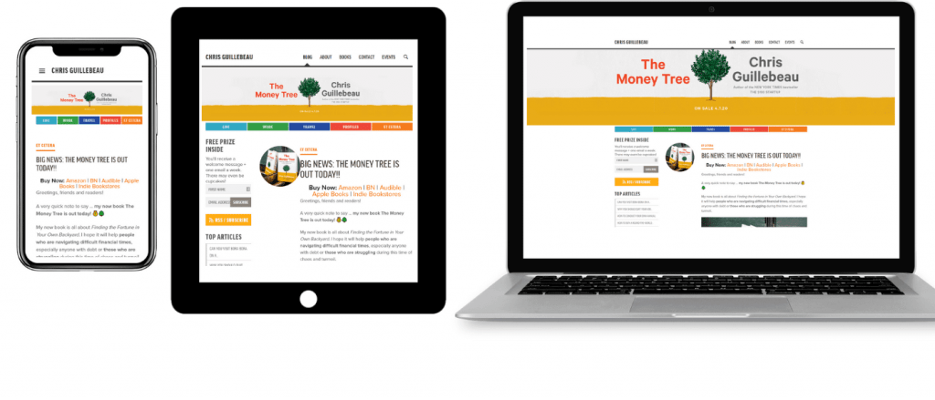
Example #1: QuickBooks
QuickBooks has a clean page structure, a clear value proposition right up front, and distinctive color for CTA buttons in both the desktop and mobile versions of its website, with a lot of white space in both the desktop and mobile versions.
The desktop version has a full navigation bar in the website header, including more information on special deals in the hero section.
The above-the-fold portion on the mobile version, on the other hand, displays exactly the perfect amount of information with a hamburger menu and to-the-point CTAs.
Example #2: Shopify
Shopify has done an excellent job with responsive design. The following are the key features that make its website attractive and simple to use in both versions:
- Copy that is clear and concise
- Video that is unique and of great quality
- Attractive CTA that entices visitors to register for a free trial.
The desktop version's navigation menu with drop-down selections adjusts to a smaller screen as a hamburger menu. Aside from that, the desktop header links to "Pricing" and "Learn" pages, but the mobile version just has a single "Login" button.
The wrap-up
Nowadays, users have very high standards and Google feels the same way. Static websites, in fact, will no longer suffice. Responsive design is the way of the future, with new techniques and excellent examples emerging every year. Designers everywhere take a fresh look at their products, focusing on the content and arrangement like Tetris players. And they are perfectly right.
Hopefully, after reading this, you'll have a better understanding of the factors that go into responsive design and how these aspects interact with one another. At the end of the day, we all want to provide a genuinely fantastic and consistent user experience, and responsive design helps us do just that!

Joel Pham
Joel Pham is the CEO of Magenest, with extensive experience in eCommerce, business operations, and digital transformation. He has led projects for major brands across Magento, Shopify, Odoo, and enterprise technology solutions.

![[Infographic] Magento 2 Migration - Why not?](https://store.magenest.com/wp/wp-content/uploads/2019/06/infographic-about-magento-2-migration.png)
Weekly Trending
-

Confirmation code: 5 things you need to know about it
March 30 2021 -

Customer Value and Satisfaction: What's the Difference?
October 30 2020 -

Social sharing 101: Its Definition, Benefits & Examples
December 11 2020


Recent Posts
-
Payment Gateway Comparison - Top 5 Providers in 2026
April 1 2026 -

Magento 2 Stripe Extension: Installation & Configuration
December 29 2025 -
5 Best-selling Magento 2 Extensions to check out before 2026
December 19 2025 -

8 Best Magento Subscription Extensions For Online Businesses
December 8 2025 -

How to set up payment methods in Stripe Payment Gateway
September 21 2025