
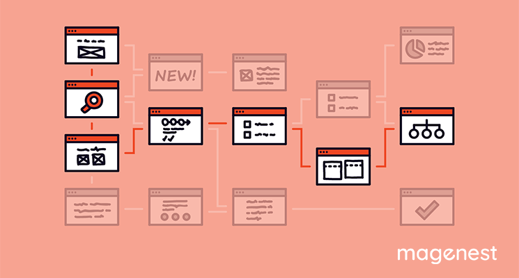
Table of Contents
The trends of design in the eCommerce area are undergoing a change quickly. While your eCommerce website wants to bring the most outstanding shopping experience, you also desire to attract more and more shoppers.
To do that, your website’s colors, shapes, fonts, and photography are some main components to keep the visitors for longer on your site. However, without a perfect navigation design, the visitors can be frustrated with your website despite a good-looking appearance.
Navigation is sometimes taken for granted; nevertheless, it is really important to make site visitors look at more than only your home page. Navigation enables the movement from one page to another page on the eCommerce websites. A great website always has intuitive navigation and menus which make instant sense.
We’ll explore some leading navigation trends used by eCommerce websites.
Let’s start out!
Sticky or Fixed Navigation Bars
Sticky Navigation Bars keeps your navigation menu in a fixed place, so shoppers can navigate from point A to all other points on the page. This is because the navigation bar follows them while they scroll down to take a deeper look at content. This type of navigation design is suitable for websites wanting to keep many navigation items sticky as well as preventing your users from getting lost.
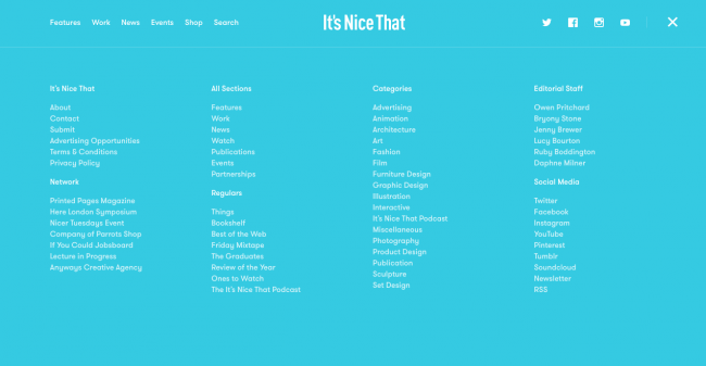
Mega Menu
Mega Menu has become increasingly popular among magazine-style blog websites. They are unlike normal drop-down menus since it allows a wider rather than downward vertically. It includes multiple columns of content instead of just flowing down vertically these mega menus expand wider.
This form can be ideal for the website with a great deal of content to show, but it doesn’t work well with the mobile version because of small size and less space.
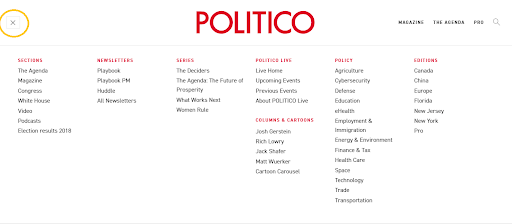
Responsive Sub Navigation Menu
Responsive Sub Navigation Menu is a good choice for you if your website has plenty of pages. It works well for mobile platforms or small browser windows by hiding numerous navigation links on, so the menu will be fitting. This navigation type creates the space-saving benefits of a drop-down menu but conceals them by default behind a “hamburger” icon for expanding across the content section.
For example, Politico's mobile site uses small plus signs (x) to indicate a sub-menu beside each link.
Vertical Sliding Navigation Trend
This design is widespread among portfolios or creative agencies that push the boundaries of traditional web design.
Vertical navigation is adopted on several websites and it works extremely well. Here, it keeps visible all the time meanwhile icons link from the side; therefore, users will click on n icon instead of hamburger icons.
It could be an experimental style for website designers, but it will showcase your creativity and come up with a variety of concepts of navigation in comparison with traditional style.
Globally Hidden Menus
You can realize an exploration of hidden menus with hamburger icons in responsive design, so users probably view it at all times and are satiated with it. Global Hidden Menus is a new breeze for eCommerce websites. Although it doesn’t help the visitors access to link instantly, it creates more space on the screen by removing the navigation from sight.
This navigation trend is increasing favorite by more shoppers using smartphones and growing familiar with the hamburger icon’s significance.
Single Page Navigation Trend
Single page navigation is the final navigation trend we want to recommend, but it’s no less powerful than other ones. Several websites – especially those with less content to display – are applying a single page with anchor points: a click on menu items and the page automatically scrolls to the corresponding section.
Besides fixed navigation bars, dot navigation - plenty of circular icons situated on the left or right side of the screen - also may improve the natural sleekness of single-page sites.
It's time to adapt navigation trends for your eCommerce website
We hope that the above-mentioned navigation trends for website design will help your craft a beautiful and functional menu. If you need any help with your Magento 2 site, send us an email at sales@magenest.com. See you in our next article!

Morph Mai
Marketing Executive | Content Manager

Weekly Trending
-
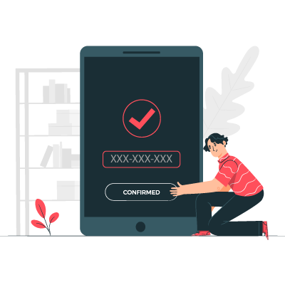
Confirmation code: 5 things you need to know about it
March 30 2021 -
How to create a message queue in Magento 2
July 28 2020 -

How to add products to cart programmatically
December 14 2023 -

How to login as customer in Magento 2 - A Step-by-Step Guide
September 21 2020

Recent Posts
-

11 Best Magento 2 Social Login Extensions Free and Paid 2024
January 27 2024 -
Payment Gateway Comparison - Top 5 Providers in 2024
January 21 2024 -

6+ Voice Search Statistics and Trends You Can't Miss in 2024
January 20 2024 -

2024 Hottest Trend: Voice Search Technology
January 16 2024 -

Salesforce - No.1 CRM Platform for Magento In 2024
January 14 2024