Post-click landing pages can be used in a variety of ways. They can be used to convert visitors on a specific offer across industries, teams, and services. However, their usefulness does not end there. While it’s rarely considered, products need their own landing pages too.
Product landing pages are the ideal option for businesses that depend on paid advertising. If you have a product and advertise it without a post-click landing page, you're losing a lot of money.
Today, we'll go through the structure of product landing pages, give some design and copy advice, and look at some real-world examples.
What is a Product Landing Page?
A product landing page is a post-click page designed to persuade visitors to convert on a product-related offer. It resembles a traditional landing page in terms of design. To attract visitors to click the CTA button, compelling headline, benefit-oriented language, hero images, social proof, and more. The only thing that differentiates it from other landing pages is that it is only used by businesses that sell goods.
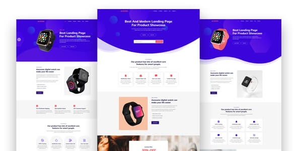
Assume you're in the business of selling clothing to pregnant moms. Users are searching for “maternity clothes 4 months” on Google. They can come across your landing page dedicated to products for four-month pregnant ladies in the search results and click on it if the title and description of the page appeal to them. They convert by purchasing if your offer is suitable to them.
The average conversion rate for product landing pages is 2.35%, according to WordStream's study. However, the top 25% of pages convert at a rate of 5.31%, while the top 10% of pages convert at an amazing rate of 11.45%.
Every landing page is a potential for conversion, therefore the more you have, the more targeted they may be. The secret, though, is not in the number of pages you create, but in how you develop and design them, as well as how you write your copy. We'll talk about design and copy later, but for now, let's look at the overall structure of a product landing page.
Key Difference Between Homepage vs. Landing Page
The landing page is laser-focused, whereas the homepage offers dozens of possible distractions—you could call them "leaks" instead of links. Fewer links on a landing page boost conversions since there are fewer tempting clickables to distract visitors from the call to action. That's why professional marketers constantly direct their traffic to a specialized landing page.
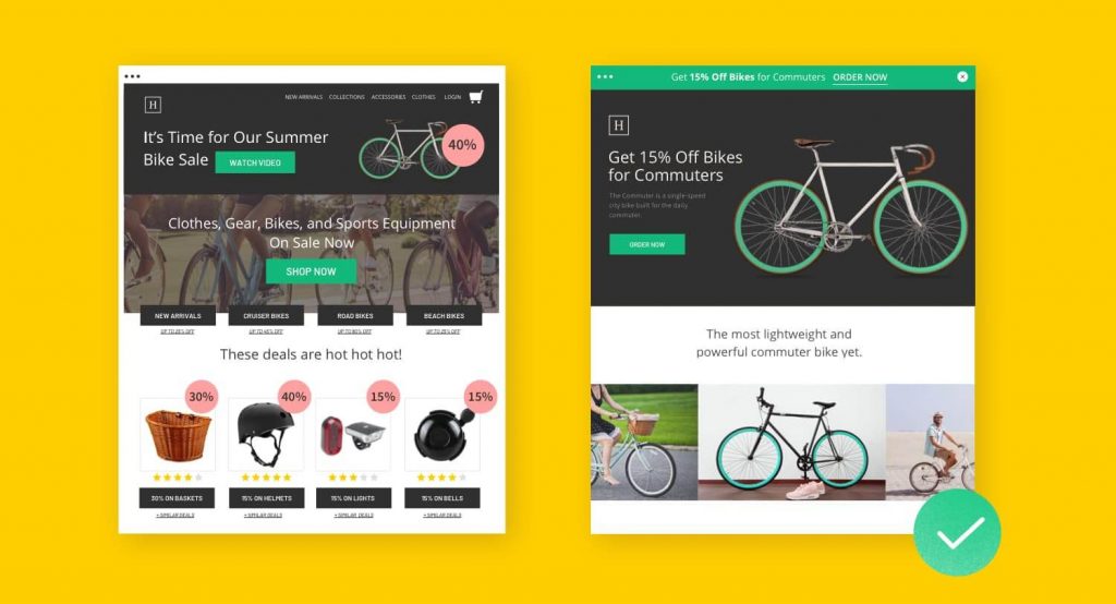
Indeed, the homepage is amazing. It promotes the brand, allows users to browse a variety of products, and provides more knowledge regarding the company and its values. A visitor can go anywhere from here, including applying for a job, reading press releases, reviewing the terms of service, and posting on the community boards.
However, they are unlikely to make a purchase. And that is exactly the point.
This customer's landing page has a completely different purpose. Everything about it works hard to convert these people into customers, paired with incredibly slick ads that promote a single offer. It converts more of the traffic that the brand already receives. That's how powerful landing pages can be.
Types of Landing Pages
There is a lot of variation out there depending on the business, but there are really only two classic landing pages (defined by their objectives):
Landing Pages Lead Generation: These pages, often known as "lead generation" or "lead capture" pages, use a form as their call to action. Almost always, this form captures lead data, such as visitor names and email addresses.
This form of a landing page is used by B2B marketers and organizations offering high-ticket items to establish a list of potential customers. In exchange for contact information, they may provide anything for free, such as an ebook or a webinar.
Click through Landing Pages: Clickthrough landing pages are frequently used by eCommerce and SaaS (software-as-a-service) marketers to drive sales or subscriptions. As a call to action, they usually contain a simple button that takes the visitor through the checkout process or completes a transaction.
The Structure of a Product Landing Page
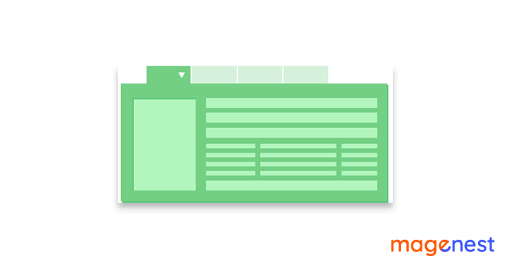
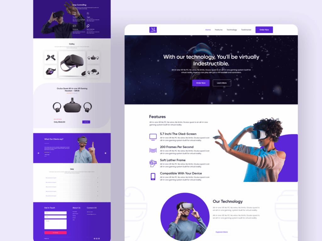
Product landing pages are made up of many different parts, each of which has its own function. Blocks follow one another in a logical order, culminating in a call to action. It's best to start creating a landing page on the paper block by block so you don't get distracted by little things like logo size or font color and instead focus on the structure. You can search for product landing page design inspiration to further broaden your mind.
Header
A header, which typically has a logo, main menu buttons, login, and sign-up buttons, a title and description, CTAs, and accompanying visual elements such as a background video, a photo, or an image of a product, is the first thing visitors see on your website.
You should explain the services you provide, illustrate how to use your app, and include two types of action buttons: one for registration and another for a product video. You may include a special offer at the top of your header, allowing new users to try your app for free.
The main goal of the header is to give the most important information about your product to the reader right away. If you strike the mark and the information is useful, people will scroll down for more information.
A title that stands out should incorporate a brief summary of the benefits your product will provide to customers, as well as a call to action, all in a 2-3 word sentence. You can write a couple of short sentences in the description to elaborate on the title and reveal essential data that viewers need to know right away.
Product and Detailed Description
It's time to teach visitors more about the product after they've been introduced to it. You should start with the customer experience in the description and focus on the customers' pain points. Demonstrate how your product works and how it can solve your audience's real or potential problems. Then, as a bonus, add a few more details. They may not be a key benefit to the user, but they will be a great complement to the main product.
Try to lead your visitors' attention across the website and make sure that every key point is highlighted visually.
Social Proof
In fact, 15% of users are unlikely to trust a company that lacks reviews. That's logical, given that social media and online interactions currently allow individuals to freely share their thoughts on any product and read reviews from others who have tried it.
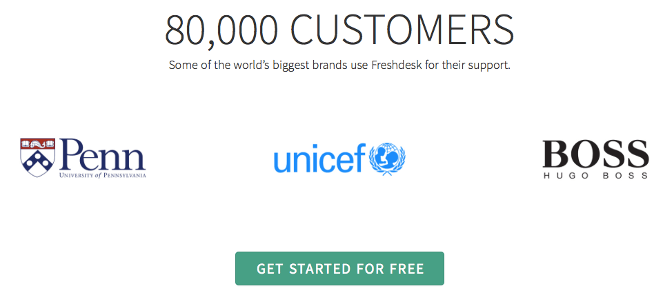
Customer reviews can be shown in a variety of ways on a product landing page: adding anonymous text reviews; adding text reviews with customer names and images; adding video testimonials.
Below is one of the social proof of product landing page examples.
You can, for example, choose to show anonymous reviews. Furthermore, put the main idea of each review in bold at the top to make it easier for users to grasp a large amount of content. Visitors may scroll through the reviews to see more, which is a clever way that can save space on a landing page.
Call To Action
A call to action button is the principal user destination on a landing page. You may repeat the CTA a few times across the page and even change the text for multiple CTA buttons to see which one performs better.
Footer
The footer is the final section of the product landing page. The menu, social media links, email subscription forms, and other buttons may appear to be the most "boring" section of the page, but it actually includes highly significant information.
Chatbox
A chatbox is an element that is normally put above all other blocks on a product landing page. It enables users to ask questions about the product and receive instant responses and assistance.
How Does Product Landing Page Work? - The Conversion Process
- Step 1: When someone sees a call to action, he/she will be directed to a landing page with a form.
- Step 2: The visitor completes a form, converting them from a visitor to a lead.
- Step 3: The data from the form fields is then saved in your database of leads.
- Step 4: Based on what you know about the contact or lead, you would market to them.
You'll be able to see what offer the lead converted on when they converted, and what other interactions they had on your site if you use a marketing automation tool. This information will allow you to nurture this lead in a more targeted manner by helping you in determining the best marketing steps to take.
A nurtured lead is more likely to develop into a marketing qualified lead (MQL) and progress faster through the buyer journey, which helps show the return on investment (ROI) of your marketing efforts and keeps your salespeople happy.
Although the landing page is the most important element of the conversion process, there are other components that work together to ensure a successful conversion.
- CTAs (Calls to Action): A call to action (CTA) is a picture or a line of text that encourages your visitors to take a certain action. CTAs on landing pages indicate where the visitor should click to get the offer. CTAs can be located on pages of your website that provide content that relates to your offer, as well as on relevant blog posts that support the content in your offer. The more closely the CTA matches the landing page and other pages where it is advertised, the more likely a visitor will convert.
- Landing page: The form that a visitor must fill out in order to access the offer is located on the landing page. As previously said, its main purpose is to describe the benefits of a certain offer and urge visitors to become leads. A visitor should be led to a "thank you" page after submitting the form.
- Thank you page: Although most tools include an in-line thank you message, it is recommended that you provide your new lead with a special thank you page. New leads can use the “download now” button on thank you pages to get the download you offered on the landing page. Thank you pages are a wonderful way to extend the conversion process and push the lead along the marketing funnel in addition to hosting the offer. Secondary offers (case studies, consultations, webinars, and more) should be displayed on the thank you page via a different form or special CTAs to direct the lead to the next step.
Why a Product Landing Page is Best for Conversion
A product landing page is more appropriate in this case than a product page because the visitor is looking for a specific product.
- With a 1:1 conversion ratio, it keeps the visitor focused on the offer.
- It relates to the referring advertisement's message. To fulfill the promise of the ad and to let visitors know they've landed at the right location, every ad requires a dedicated post-click page.
- Throughout the second half of the campaign, customization is maintained. The pre-click experience is the first half of the campaign. You must use the same targeting you used on the ad in the pre-click experience on your product landing page in the post-click experience. If you don't, your visitors will have an inconsistent experience. Advertisers may generate product landing pages as quickly as they produce ads using post-click automation.
- It quickly highlights the software's benefits.
- It increases trust by using authority signals such as popular user logos.
Conclusion
The digital marketplace is constantly changing, and as merchants, we must adapt as well. It might be confusing at times, but making the effort to plan ahead will pay off in the long term.
If you're going to advertise a product, it needs to have its own personalized product landing page based on product landing page templates to deliver a consistent user experience. And if you only personalize half of your campaign, it's unlikely that your visitors would convert, leaving money on the table.
Remember that, in the end, your campaign's goal and target audience are the most critical factors to consider.
