

Table of Contents
The website navigation always plays an important role in businesses’ sales, conversions rates, and bounce rates.
Normally, if website visitors can’t work out where to find what they want, they’ll immediately leave for your competitors. Do NOT let that happen. That’s the last thing you want. In regards to usability, ease-of-navigation should be a topmost priority. Don’t leave users lost by confusing or annoying features and wondering what to do next.
So, what exactly is website navigation? And why are easy and usable navigations important for websites? This article will propose some interesting website navigation best practices with different types. You can follow these simple guidelines to create user-friendly site navigation.
What is website navigation?
According to Wikipedia, website navigation denotes the process of navigating a network of information resources in the World Wide Web, which is systematized as hypermedia or hypertext. The user interface used is called a website browser.
Why Is Website Navigation Essential?
Without web navigation, your website visitors can’t work out how to find your blog, your product listings, pricing, your contact information, your email signup page, or help documents.
Ideally, all visitors would start on your homepage and follow the same path through your website. But the situation is different: website visitors navigate from all over the place. So, you can begin with the “rule of thumb”: Your website navigation should enable people to land on any page on your site and locate what they want within just 3 clicks.
Be aware that if you want to retain people on your site, provide them reasons to click on links by inciting curiosity and luring them to great offers.
5 Types of website navigation
A website navigation system is similar to a road map that facilitates website visitors to explore and discover various areas and data included within the website. They will no longer have to experience the site navigation with inefficiency and incompetence.
Website navigation can be classified into different types. The major and well-known ones are below:
Hierarchical website navigation
The hierarchical structure of the website navigation is set up from general to specific. This put forward a clear, effortless path to all the web pages from a place on the website.

The horizontal navigation website menu design is conventional but purposeful, sewing up the reliability of the organizational structure and lowering the time cost for users to discover the information they are seeking.
Global website navigation
Global website navigation manifests the top-level sections/pages of the website. It is accessible on each page and lists the material content sections/pages of that website. It is more personalized and fashionable.
Local website navigation
Local navigation is a set of links within the text of a web page, connecting to other pages within the website. It provides a mechanism for website visitors to navigate a subset of a larger website.
Styles of web navigation
Web navigations vary in styles among various websites. The availability of various navigational styles enables the information on the website to be delivered easily and quickly. This also distinguishes the categories and the sites to indicate what the important information is and to allow the users access to more information and data presented within the website.
All over the world, different cultures favor certain styles for web navigations, allowing for a more pleasant and functional experience as navigational styles expand and differentiate.
Navigation bar
A navigation bar is a part of a website, designed to support visitors in traveling through the online document. It shows up at the top of the screen, below the status bar, and allows navigation via a sequence of hierarchical screens.
Sitemap
A site map is a listing of pages of a website available to crawlers or users. It can be either a document used as a planning tool for Web design or a Web page that lists the pages on a Web site, typically arranged in a hierarchical fashion.
A sitemap is a depiction of the website’s content that is created to help not only the people but also the search engines itself and it comes in many forms. How site mapping is adopted can vary markedly.
Dropdown
In computing with graphical user interfaces, a dropdown menu or drop-down menu or drop-down list is a user interface control GUI element ("widget" or "control"), similar to a list box, which allows the user to choose one value from a list.
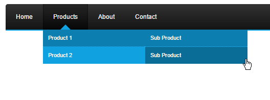
The drop-down navigation website menu design is regularly termed a drop-down menu, which is very popular navigation.
An upgraded and more innovative version of the dropdown menu is the mega menu, which is widely used by many online commerce stores in this era, because of its excellent interfaces to enhance customers' experience. The difference is that the mega menu is horizontally extended to a multi-level dropdown menu.
Mega menus are prevalent in magazines and blog site navigation. They may contain numerous categories of content with certain super-menus expanding wider.
Flyout menu
Flyout menus are nonpermanent navigation tools that users exhibit when they interact with a button or an action. Flyout menus enable users to access a listing of actions and choices.
A menu that flies out down or to the side when you click or hover some GUI factor in computing with graphical user interfaces.
Named anchor
It is called an anchor because web designers can apply it to anchor a URL to some text on a web page. When users see the web page in a browser, they can click the text to activate the link and hit the page whose URL is in the link.
3 Best website navigation examples to follow
#1 The Good Burger
This burger-making company’s website menu bar is one of the amazing navigation menu examples.
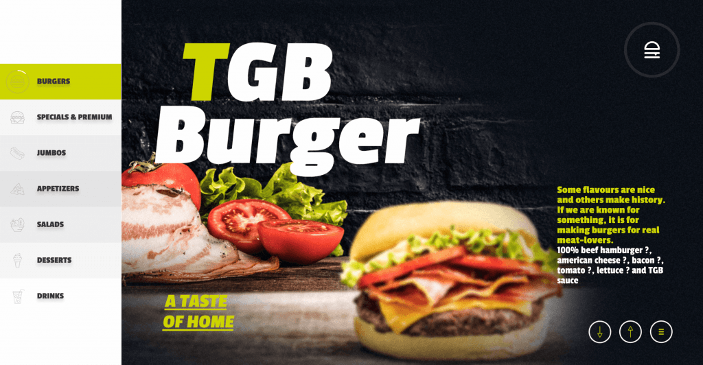
The homepage has a burger menu icon that contains the top layer of the bun – which in itself is wonderful.
Once users click the expandable website menu, they are welcomed by 5 different links to the most important pages. The exclusive interaction and enjoyable visuals as users hover over a variety of options make the entire navigation process embracing and unforgettable.
Its “Menu” page lists all the categories of products TGB offers, but with a twist: horizontal scrolling, finished with illustrations and interactions. It grants users a pleasant surprise when they expect a usual grid of lists with regular scrolling.
#2 ETQ
ETQ is all about the minimalist vibe of website menu examples.
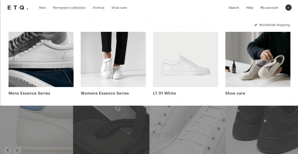
This website navigation menu example uses a navigation bar at the top of the screen as a highway to the decreased number of categories. The outcome is that the website navigation bar leaves a great proportion of negative space – including the expandable menu users see when they hover over the bar.
Another engaging detail about navigation on the ETQ website is their product page. ETQ performs cross-selling in a smooth way users won’t even realize, similar to Amazon.
In particular, users find 3 different products under the CTA “You might also like” that somehow associate with the leading product on the page. It’s subtle and allows users to reach these extra suggestions naturally.
#3 Punk Ave
Punk Ave design agency is one of the most exceptional website navigation examples.
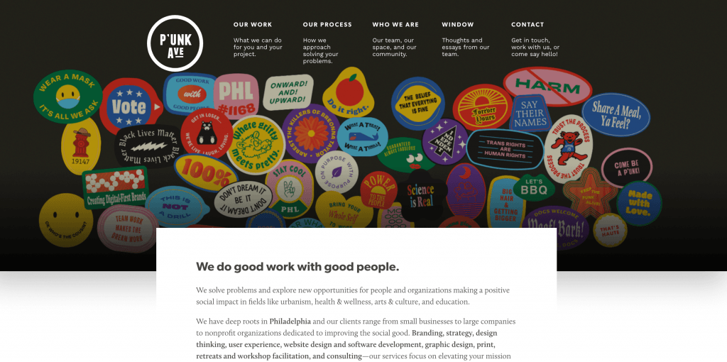
Punk Ave has released a great website navigation bar design at the top of all screens on the website. It doesn’t just contain the principal concept, but also a pretty summary of what users will find on each screen.
It is even more helpful when it comes to user orientation: the secondary navigation bar appears below the header of the screen. For example, on the “Our work” page, users will encounter numerous other subcategories - depending on what kind of industry users would like from Punk Ave.
The interactions are modest but outstanding due to the bright colors and subtle animations towards the navigation experience.
Yet, the website of Punk Ave is a wonderful website navigation example for businesses that don’t have a large number of items or categories. Nevertheless, it’s not about attaching as many pages as possible on the navigation bar – it’s about making every page count.
Is there any navigation menu design that sounds interesting to you?
If you are desired to have fabulous website navigation similar to the above website menu examples, try our product: Mega Menu for Magento 2
Magento 2 Mega Menu is a helpful extension to design and optimize the website's menu with various options. This tool encourages your Magento store to gain more attraction and improve customer’s experience.
Don't miss this chance!
5 Tips for the best website navigation design
#1 Be As Descriptive as You can
Your navigation menu shouldn’t be a blurry list of subjects. If a web visitor doesn’t understand specifically what to expect from each option on the menu, they’re unlikely to be navigated beyond your landing page.
Avoid this by consulting the best website menu design, making each of your menu options as clear and descriptive as possible, without causing them too long.
#2 Not to Compromise all Function for SEO
Everyone is trying to insert keywords and other SEO strategies into your website, many are utilizing SEO on their web menu design as well. Getting your site ranked well on Google is necessary, of course, but it’s just similarly important to acknowledge what will happen once visitors land on your page.
To avoid ending up with unnatural booming headings or complicated menu choices, skip some of the SEO tactics when designing your menu, and follow other website navigation practices instead.
#3 Make Clear Hypertext
One of the most basic problems is allowing the design to get in the way of usability. If web surfers can’t tell a hyperlink from body copy, you will confront a big problem.
The most natural way to make hypertext obvious is to make sure it differs from other elements on the page — and not just when the visitor rolls over the link. Format it in a contrasting color, underline it, or make it bold or italic.
More creatively, you can transform your header navigation links into buttons if you prefer to make it a responsive menu design.
#4 Place Navigation in a Standard Position
Thinking outside of the box is great, but not when it comes to the loss of user experience. Place your navigation in places wherever people expect to find it.
The aforementioned involves the header navigation bar, sidebar, and footer. Take advantage of those areas so any of your web surfers can find what they need.
If you want to add creative navigation menu design, such as by utilizing multimedia, it’s okay. However, make it clear and transparent where visitors can click.
#5 Link the Navigation with the Business’s Priorities
Funneling your visitors to the most prominent pages can boost your businesses’ conversions and sales. Leading visitors to those important pages can exert a huge impact on your business’s bottom line.
For example, incorporate the “About” and “Contact” page, together with links to your blog. Furthermore, add a great CTA, such as “Download” if you operate a mobile app or “Test Drive” for a SaaS firm.
The wrap-up
Website navigation is the core of any website. Nevertheless, we often take it for granted and overlook the user experience and website design.
Instead of copying competitors’ websites because they have a good outcome, figure out what navigational factors are most suitable for your business and your viewers.
Hopefully, with this article, you’ll find yourself with plentiful inspiration! And remember: web navigation design is firmly connected with other aspects of the website, such as information architecture or interaction design.

Joel Pham
Joel Pham is the CEO of Magenest, with extensive experience in eCommerce, business operations, and digital transformation. He has led projects for major brands across Magento, Shopify, Odoo, and enterprise technology solutions.
Weekly Trending


Recent Posts
-
Payment Gateway Comparison - Top 5 Providers in 2026
April 1 2026 -
Magento 2 Stripe Extension: Installation & Configuration
December 29 2025 -
5 Best-selling Magento 2 Extensions to check out before 2026
December 19 2025 -

8 Best Magento Subscription Extensions For Online Businesses
December 8 2025 -

How to set up payment methods in Stripe Payment Gateway
September 21 2025