One effect of the current lockdown has been a noticeable increase in internet traffic. Retail businesses need to take advantage of this increase and optimize their digital channels more effectively.
As consumers are being told to stay at home, there has been a big upswing in online and app-based shopping. Website design ultimately plays a huge role in helping to drive these types of sales, so it’s important to know how to do it effectively.
Here are 10 website design tips to maximize sales during the lockdown.
Simplify

In a lockdown, consumers are spending more time on the internet - it’s a fact. Not only are they spending more time on eCommerce sites but they’re spending more time taking in information in general.
So, to bring in more sales, your website needs to stand out by keeping things simple. Whether in or out of lockdown, customers will only buy from a website they understand and like to use. A crowded page will negatively impact the user experience by making the website harder to navigate.
To keep people on your website during this time, you need to keep paragraphs concise and make use of negative space to break up your important content.
Foreground the most relevant products
Context is the key to demand and peak sales.
This lockdown has no doubt impacted the habits and requirements of the average consumer. The products and services people want are specific to the situation they are in, so it’s time to make yourself useful.
Particularly for eCommerce websites, now is the time for a design reshuffle on your product pages and retitle your navigation bar to foreground the products you know people need to use in the home. Whether bean bag chairs, sweatpants, video games, guides to home baking or toilet cleaner, it’s important to push these products to the top of your pages.
Use video
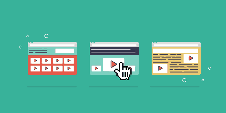
Studies suggest consumers are taking in 80% more content since the coronavirus lockdown started. You need to use this to your advantage by offering content in a form consumers like to consume: video.
Videos are a great way of driving conversions once a customer enters the buying funnel. Whether for product information, testimonials or simply to share more about your business and your history, videos help brands to connect with customers on a more in-depth level and tell them what they need to know - without them having to read it for themselves.
Make products seem real
Customers can’t simply go out and browse physical shops anymore to touch, feel and experience products in real life. To get customers to buy what you’re selling you need to recreate this experience as much as you can through your product pages.
Start by implementing mobile-ready images that are a high-quality representation of the product. Ultimately, a high-quality image makes the product look good, and a good-looking product is more likely to sell. For furniture, lifestyle or home items, try including product dimensions so customers can tell exactly if the product is a good fit.
This not only shows customers that you go the extra mile to make their life easier, but it also reduces the chances of returns later down the line.
Testimonials
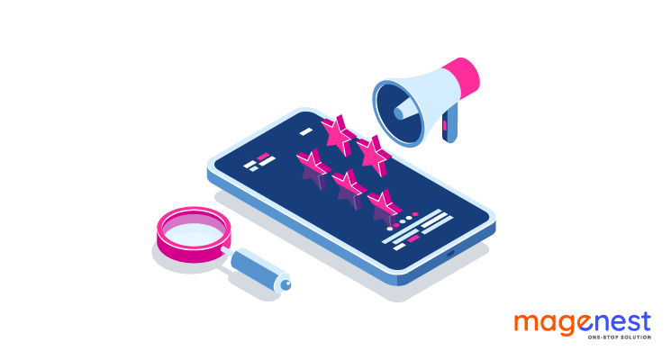
In uncertain times, customers are looking for a website and brand they can trust. Right now, consumers have the time to do even more research before making a purchase.
For this reason, you need to ensure your homepage and product page designs incorporate real-life testimonials or trust symbols to act as social proof of your business’ reliability.
With uncertainty over how businesses are now operating, having testimonials from lockdown customers will also prompt more attention from those first-time customers who may still be on the fence about buying from a new company.
Optimize for mobile
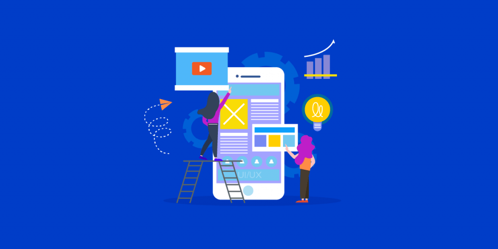
As of March, when lockdown started, mobile phone use increased by 70%. To really maximize sales during a lockdown, retailers need to look towards optimizing their designs for mobile channels. This means any buttons should be large enough for a finger to click on as well as having CTAs within the range of a thumb.
Also bear in mind that smartphones were designed for scrolling - so make sure your key pages are designed to be scroll-friendly with important features or what you deem your most sellable products kept away from the end of the pages.
Non-intrusive business updates
Customers want to stay informed about all the changes and new measures in place to cope with the lockdown.
First and foremost, they want to know if your business is even open as usual. The best practice for this is implementing a banner at the top of your homepage that explains as much. Banners are better than popups simply because they are eye-catching, non-intrusive, and cannot be closed - meaning customers won’t miss your message.
Integrate an information hub
When Coronavirus spread, businesses took the opportunity to incorporate a new page dedicated to explaining the impact of coronavirus on the business as well as reassuring customers. By making the page easily accessible in the navigation bar, you can effectively let customers know in one glance that you are taking the situation seriously.
The page should contain all relevant information about new business operations in light of lockdown including safety precautions for staff and updated delivery details. Reassure customers your business is taking all necessary steps to keep them and your staff safe. This way, customers will be all the more likely to want to support you and your business.
Streamline checkout process
You want to keep a customer’s attention throughout the whole purchasing process. With an increasing number of businesses pushing to improve their digital presence, there is competition for consumer attention.
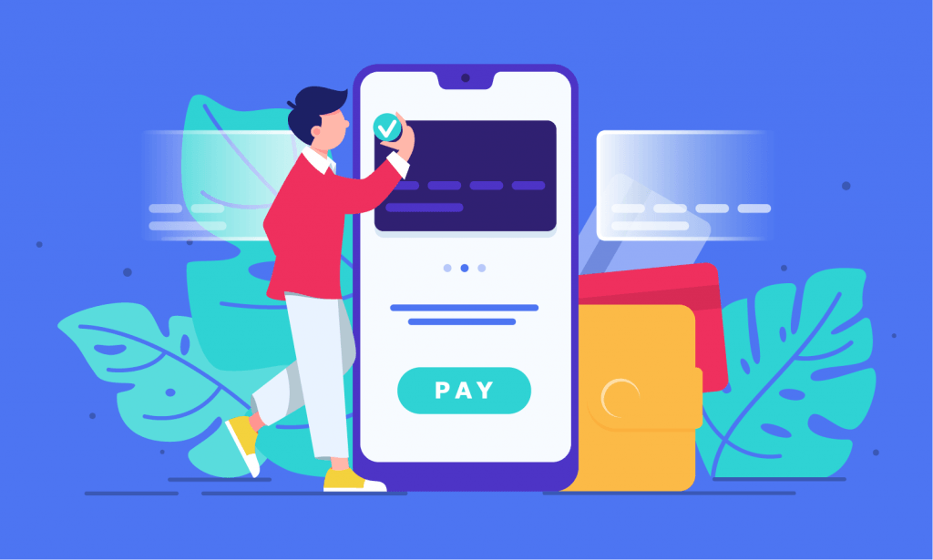
You need to make things as quick and easy as possible for customers, so they choose to buy from you and not your competitors. Design a checkout process that is completely streamlined. This means no long contact forms, no signature requirements, and enabling guest checkout.
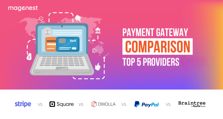
It also means redoing your CAPTCHA verification to reCAPTCHA where customers only need to tick a box. You should also review your payment gateway to see if it’s optimized for speed and safety.
Think ahead with social sharing buttons
Right now, it’s also important to be thinking ahead. Businesses need to implement design features that will grow the customer base in the future, even after lockdown is over.
Ultimately, sales depend on awareness as much as everything else. With follow or sharing buttons placed on your website, you can increase the chances of customers passing on your information to other potential customers.
The key to social sharing buttons is to not make them pushy. People don’t want to feel strong-armed or tricked into doing anything, so be careful how and when you use these. Be sure to place them away from the navigation and away from CTA buttons so customers don’t click them by accident.


