
Table of Contents
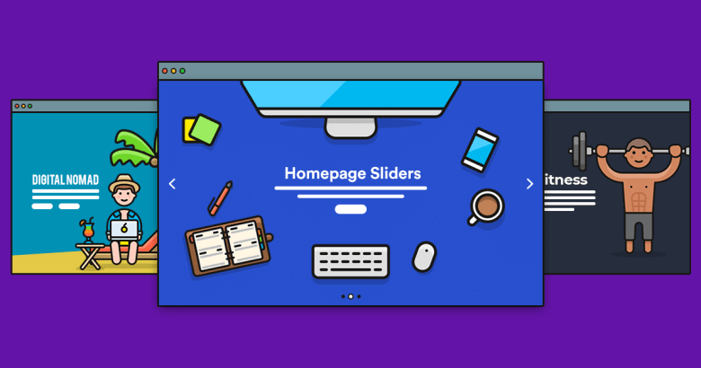
Do you know what are the words to call the visual slideshows running on a loop at the top of various website's homepage?
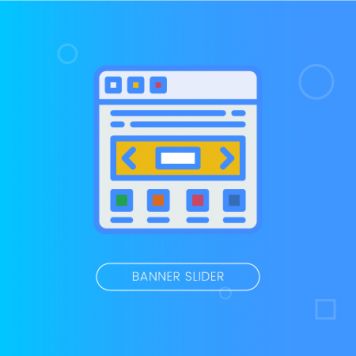
That's the banner slider, for your information.
In the world of marketers, these sliders, either banners or images, are just a promotional field, also where to display some promotional messages along with a mixture of texts, images, or even videos, in an auto-rotating loop.
Despite its clever design, a promotional carousel banner slider miserably fail at driving conversions. Researches have shown that only about 1-2% of your website visitors will ever click on that banner (but likewise, that might have been an unintentional click).
So, how to create the best one? Let's get the ball rolling to find out the most suitable way for you to create the most effective promotional banner slider for your eCommerce site:
What is a Promotional Banner Slider?
A banner slider, which has become a fundamental of many eCommerce stores, is a graphical display. It can be used to push instant engagement with your website visitors so that store owners primarily use it to promote their campaigns such as sales opportunities, that would otherwise have to be searched for or found out by chance.
Sliders are one of the most controversial regarding user interface in web design. Many love banner sliders, but many hate them. The same seems true for web developers: some developers cannot picture a website without them; others never think of using them.
One of the main reasons for such difference is that on the one hand, website sliders are great instruments for displaying lots of information within a small space, on the other hand, they can be an user experience blunders, SEO-killers, and destroyers of marketing strategies. For this reason, with such rational arguments for and against, using sliders in web design, especially a promotional banner slider, is always a case of personal preferences.
Still, Promotion Banner Slider is an all-embracing solution for marketing promotions. A number of banners can be created and placed on any page of your store, up to your preferences, in order to grab your visitor and customers’ attention.
4 Tips to Design the Best Promotional Banner Slider for eCommerce Store
#1 Focus On the Primary Messages
Remember, too many messages are just as no message.
Banner slider with text animation may fall victim to banner blindness, and most people won’t give attention to them, but even those who do can’t truly get the message.
So, let's imagine: A visitor arrives at your site. They see a message on the promotional banner slider and start reading: “This summer you will get to…” Bam! Out. Usually, the slider moves so quickly that people can’t end up completely reading them, even when they actually want to. Therefore, concentrating on a fundamental message and action is always much more effective.
#2 Give your Users Navigation Control
Banner slider often has terrible usability since it moves automatically (often too fast) and has a very small navigation icon (if any). A key rule of banner slider design, or any other user interface design is that it should be in control of the users.
Every so often, the user is just about reading certain slide content when it suddenly switches to another slide, and they have to do nothing but wait for that particular slide to show up again. This eats away the user’s time.
A better and more effective way to operate would have been giving the user navigational control. For example, incorporate slider arrows that once you touch them, the automatic slider or rotation will stop. Not only that, it should work when you want to back to their previous site, it also can open it up.
#3 Let Users See All Banners At a Glance
Take Canon as an example of this tip. They handled its homepage carousel banner slider too well.
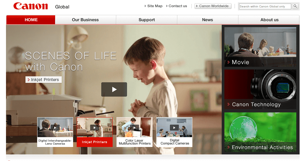
It has provided their visitor’s thumbnails for them to be able to see all the banner slider images held by the slider at a glance. This can be considered an interactive design, which can save the user valuable time. Also, since all the cards are shown, the user can decide which one they prefer to pick up and explore more, at ease.
#4 Adopt an All-inclusive Extension
In regards to the Magento-based website, since the default Magento doesn’t support any form of the banner slider on the backend. This brings up challenges for retailers if they want to upgrade the appearance of their website. So why not adopt a helpful extension instead?
Magento 2 Banner Slider by Magenest may help you improve the store performance and customer experience by furnishing you to make the most out of banner sliders.
This extension lets you present products and styles everywhere on your eCommerce website, which is an excellent way to follow the shopping journey and inspire more actions from the visitors. Your storefront now can transform with eye-catching carousels, your promotions now can stand out.
Isn’t it so great?
Wrapping up
The conversion rate of an eCommerce store is around 2.5% on average. Many of them keep wondering how to boost their sales as well as drawing more traffic to their sites. Utilizing banner sliders, with diversified content and design, can quickly catch the attention of customers and promote more interaction from website visitors.
As you can see, a carousel or banner slider is not necessarily an inferior design element.
If you are looking for higher conversions, do not use slider just to make your site cooler “wow” your visitors and nothing means more. Instead, follow some of the design techniques and tips mentioned above, or its alternatives (you know, the grids and the equivalent buckets), and while you‘re on the way, monitor and engage in an A/B test to see which one increase your conversion rate.
When all is said and done, design is just a tool to put the message beyond, and what most matters is whether people click on your CTA button or not.
Good luck!

Joel Pham
Joel Pham is the CEO of Magenest, with extensive experience in eCommerce, business operations, and digital transformation. He has led projects for major brands across Magento, Shopify, Odoo, and enterprise technology solutions.
Weekly Trending
-
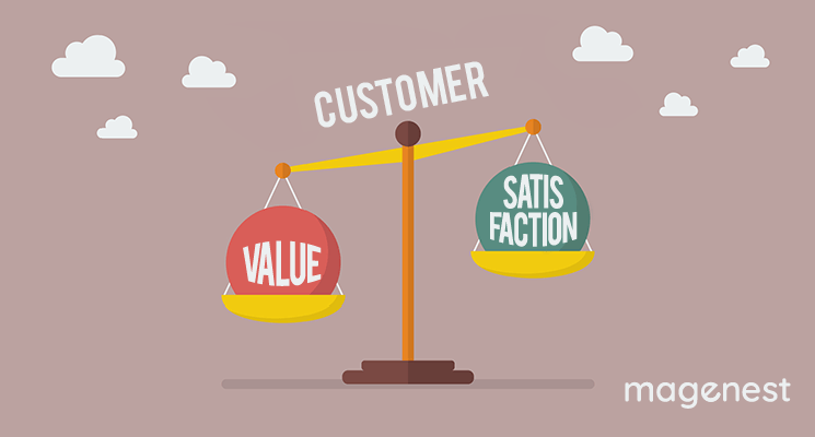
Customer Value and Satisfaction: What's the Difference?
October 30 2020 -

Social sharing 101: Its Definition, Benefits & Examples
December 11 2020 -

Confirmation code: 5 things you need to know about it
March 30 2021


Recent Posts
-
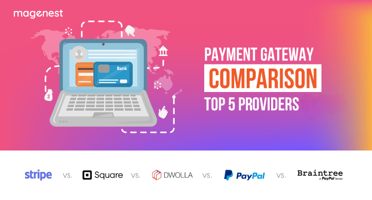
Payment Gateway Comparison - Top 5 Providers in 2026
April 1 2026 -
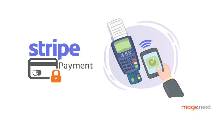
Magento 2 Stripe Extension: Installation & Configuration
December 29 2025 -
5 Best-selling Magento 2 Extensions to check out before 2026
December 19 2025 -
8 Best Magento Subscription Extensions For Online Businesses
December 8 2025 -

How to set up payment methods in Stripe Payment Gateway
September 21 2025