No matter how online shopping can bring benefits to customers on time, finance, convenience, etc. it’s impossible for customers to not go to physical stores anymore.
You can not know exactly what the product looks like until it’s delivered to your doorstep. By visit directly offline stores, there is no need to wait several days for the shipping, and of course, save you a small amount of delivery fee.
Most importantly, seeing, touching, and even smelling products create irreplaceable emotional satisfaction.
Therefore, connecting eCommerce websites to physical locations is what all merchants should invest in. Instead of adding some boring address line on your contact, there is another option that is much more effective for Magento 2 store owners: Building your Store Locator page!
Store Locator is not a new practice but you can always put in creativity and make your own store locator page that actually works and leads customers from online to offline locations.
In this blog, we’d like to introduce some great Store Locator examples from various businesses. Just pick up some amazing ideas that can be applied to your store.
Let’s start with some criteria for a good store locator page.
What elements should be included in your Store Locator?
Smart navigation system
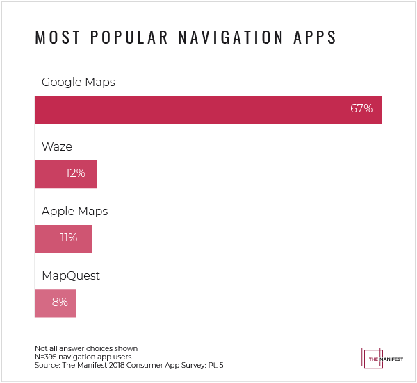
This is the core functionality of the store locator. The very first thing that customers need is that they can find the right direction to your store quickly and conveniently. We highly recommend you integrate your Store Locator with popular navigation apps such as Google Maps, Waze, Apple Maps, and MaoQuest.
To improve customer experience and compete with Apple Apps, Google adds a new feature in Google Maps app on IOS that allows users to report driving incidents including crashes, speed traps, and traffic slowdowns directly through the app.
There is no doubt that Google Maps is the dominant apps and for sure, it should be the first choice for your Store Locator page.
Advanced search and filtering functionality
Not getting lost is the top priority. However, what if the place you travel to does not have the things you are looking for? Isn’t such a waste of time? It can become worse when customers feel disappointed and decide not to come back!
The best store locator pages always contain advanced search options that customers can use to filter out approximate locations. Popular store attributes are:
- Parking Availability
- ATM
- New Arrivals
- Payment Methods
- Opening hours
- Brands
Highly responsive design
Some websites have a great store locator design for the desktop version but it turns into a mess on mobile devices. Remember that more and more people go shopping online now.
That's why all the store locator examples in this blog have a mobile-optimized design. You will miss a lot of potential customers if your store locator is not responsive to mobiles.
READ MORE: Leveraging The Benefits of Store Locator in eCommerce
Now let’s see how the big brands build their store locator page.
List of the best store locator examples in 2019
#1 Innisfree
Innisfree is a famous naturalism-oriented cosmetics brand from Korea with its presence in 15 countries and territories. The attraction of the brand comes from not only the quality of its products but also the concept and the story behind it.
Innisfree’s offline stores always create a feeling of fresh and energetic, which exactly matches with the young generation lifestyle. Thanks to the store locator page, customers are pulled closer to the brand as they can access to whatever location they want easily.
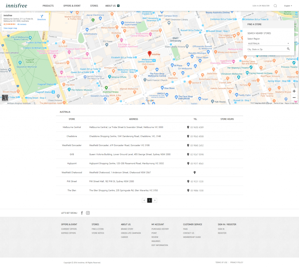
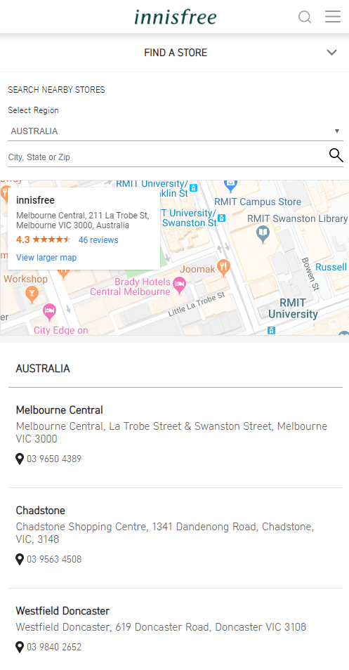
Before searching locations, you need to select the proper country and language. After that, when visiting the store locator page, all the stores have been listed already right below the map, accompanied by useful info such as an address, tel number and store hour.
The suggested store (with reviews) is shown on the top left of the map and in order to switch to another one, click on the address of your chosen store in the list.
What we love:
- Google Maps Integration: When customers click on “Directions”/”View larger map”, they are navigated to Google Maps site for detailed information.
- Restricted searching area: The country that you choose from the beginning will enable you to search for stores within that country only.
- Event notice & Site notice: These notices are put separately on another landing page. However, it would be much better for customer experience to combine them to the store list on the store locator page.
#2 Plantlife
Found in 1994, Plantlife has been providing natural, aromatherapy products to customers all around the US. To reach more potential buyers, the business has to guide people to visit its store with convenience. The store locator page completed this task perfectly.
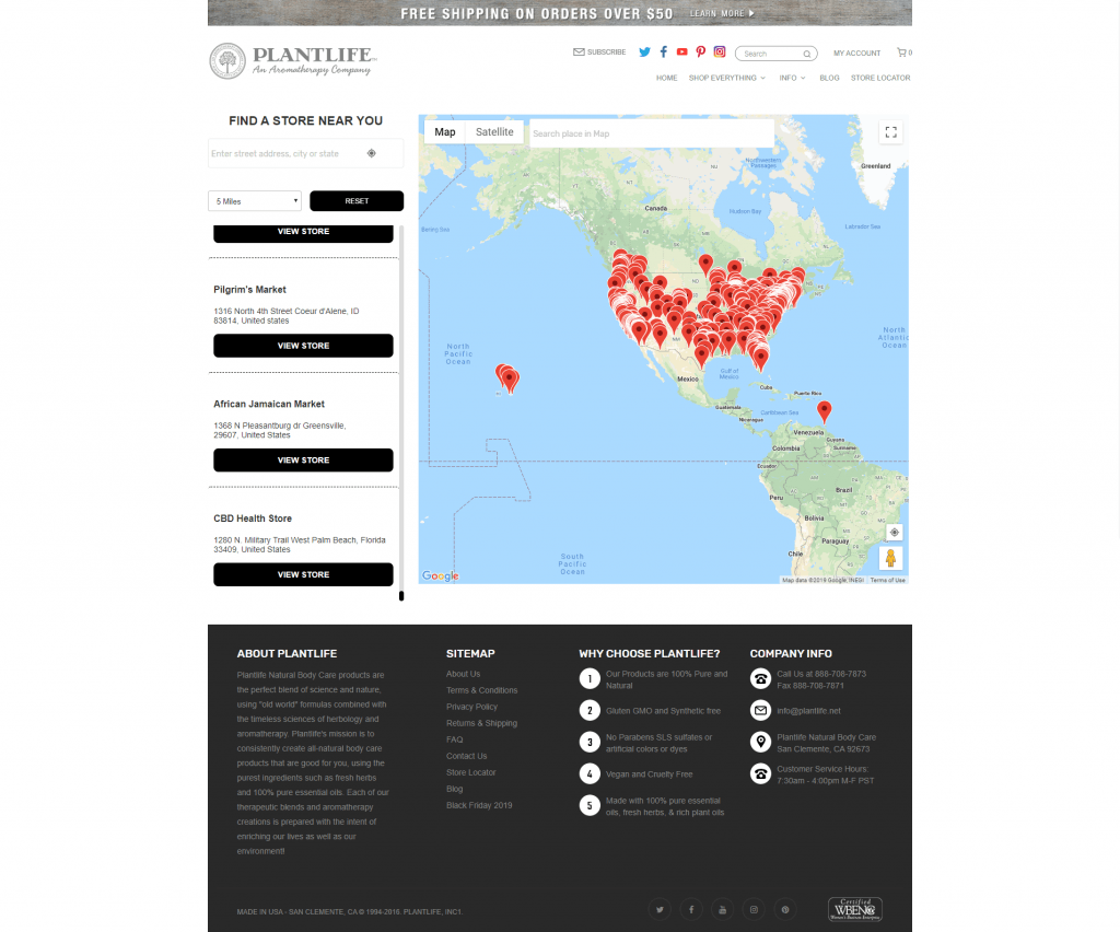
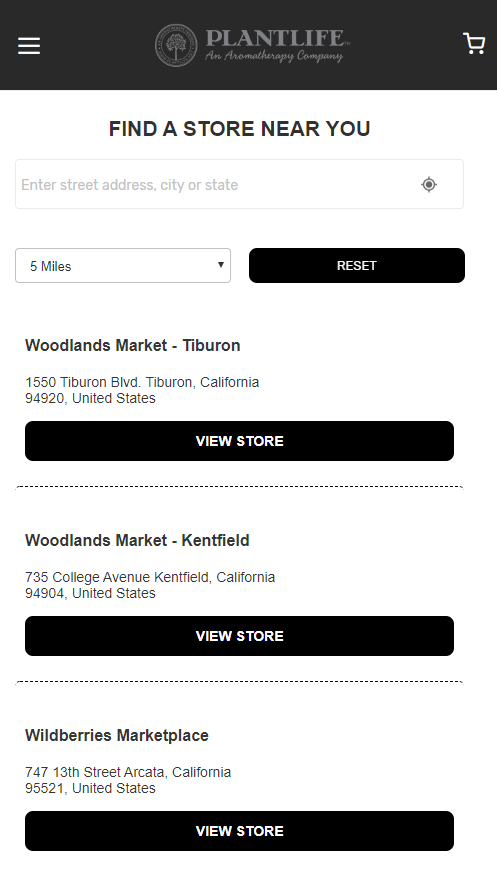
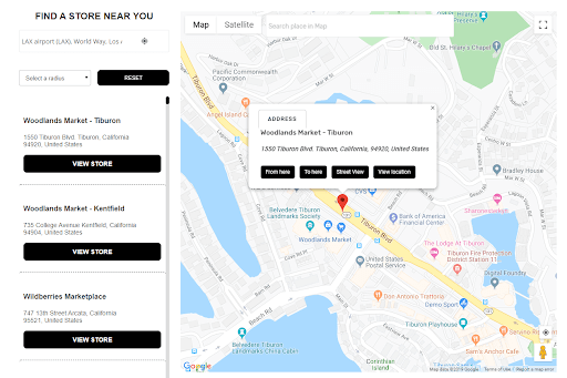
To get directions to a specific store, you need to click on the store marker on the map, then click the “To here” button in the popup. Similarly, choose the starting point with the “From here” button. Different from other store locator examples in this blog, Plantlife is the only one show directions inside the map without redirecting.
What we love:
- Google Maps integration: Beyond the ability to show directions accurately, customers can choose to view satellite imagery. The “Street View” feature is extremely useful that lets customers know how the location looks like in real life.
- Easy navigation: CTA elements are short and clear that helps customers get accustomed to the store locator page quickly.
#3 Puma
Well-known as the world’s leading sports brand, Puma has more than 13,000 employees worldwide and distributes its products in more than 120 countries. The store locator page of the company is also an outstanding example to follow.
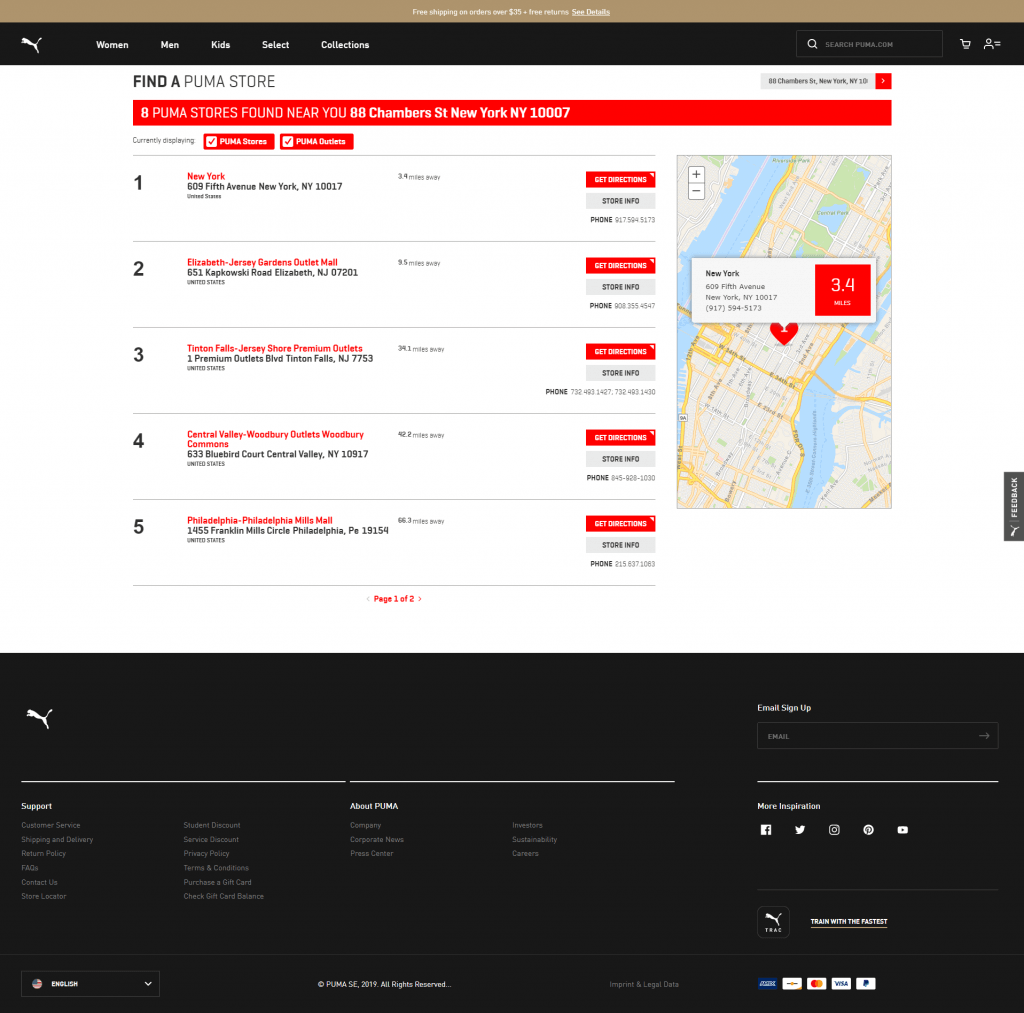
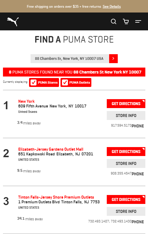
Before you can access the store locator page, you need to choose the searching area by entering a city name or postal code. As you can see, on the desktop version, the map takes up only about one-fifth of the screen on the right, leaving the center spot for the store list.
When customers click “GET DIRECTIONS”, they will jump to a new page with store detail and step-by-step instruction that allows them to travel there quickly. However, it’s hard to follow cause customers will get struggle with imagining which way to turn when the directions do not go with a map.
What we love:
- Restricted searching area: You can only view the stores located in the area you chose.
- Attractive design: The red color successfully catches the customer’s eyes and illustrates exactly the sporting spirit. Moreover, Puma replaces the normal store marker by the heart-shaped icon. Look pretty cool!
- Hovering effect: When customers hover on a store, it’s automatically shown on the map.
#4 H&M
H&M is a giant multinational clothing-retail company, operating in 62 countries. Let’s see how the brand handles over 4500 stores on one single page. This is one of the best store locator examples in the fashion industry.
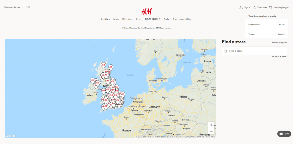
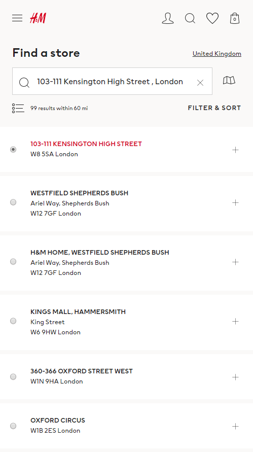
Each country is regarded as a market. Customers can change it easily through a popup, shown out from the right edge of the screen when clicking on the market name you’re currently in. Additionally, with “Filter & Sort”, you can find out all the locations with categories you want (Take care, young, children, men, etc).
What we love:
- Smart searching area division: H&M sorts thousands of its stores into each market/country clearly and makes it easy for customers to view different areas with a few clicks.
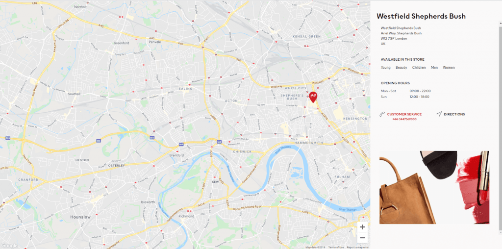
- “Cool” effect for store marker: When selecting a specific location, its marker on the store will automatically change its background color from white to red.
- Google Maps Integration: Directions are opened in Google Maps.
- Clean store detail page: With the full-screen design, H&M provides customers a clear and appealing view of the store. They can call to the store immediately when clicking on the ơhone number.
#5 McDonald's
As one of the world's leading food service brands with more than 36,000 restaurants in more than 100 countries, McDonald's supplies millions of meals daily all over the world.
Although online orders and delivery services are on the rise, lots of people still go to restaurants to get their own orders. Fast food stores are perfect places for hanging out with friends with cheap and delicious meals as well as many services.
This could be one of the most fascinating store locator examples you've ever seen.
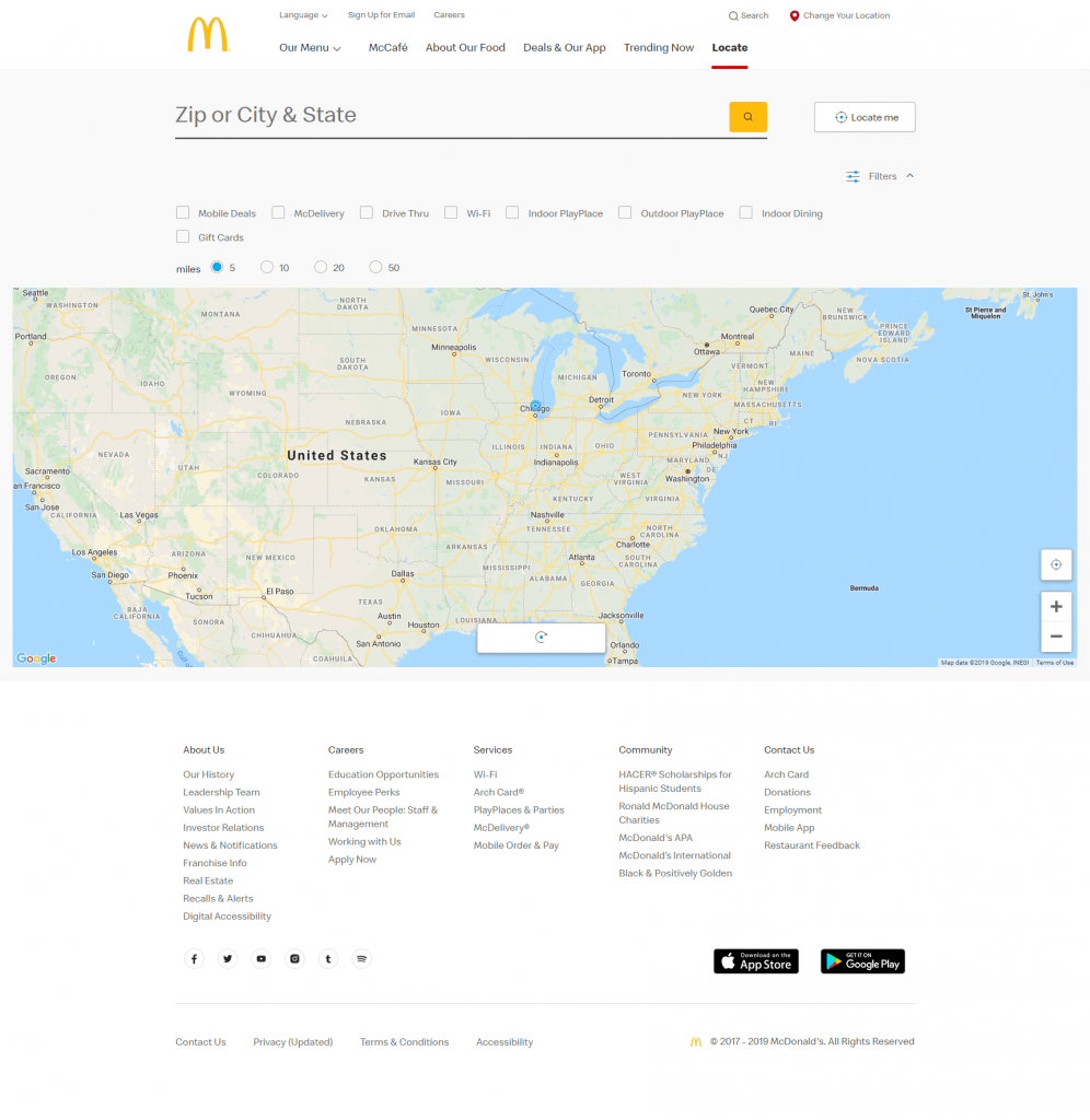
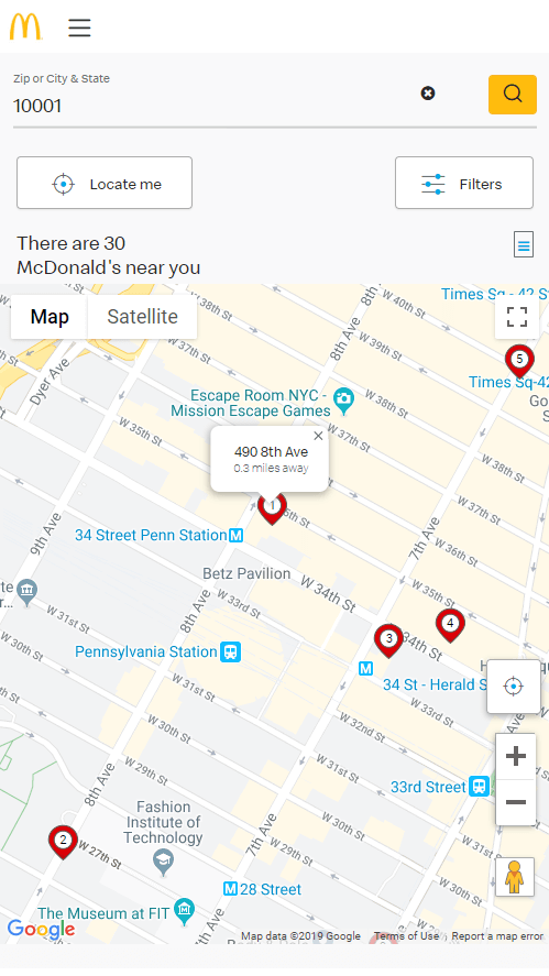
How McDonald's makes such a huge figure of its restaurants easy to be found on the map? The answer is a smart Store Locator page that you can see below.
Once visit the Locate site, customers can choose to fill their address in the search line. It can be the zip code or city/state name. Another way is to click on the “Locate me” button which automatically identifies your locations and shows the list of nearby restaurants (arranged from the nearest).
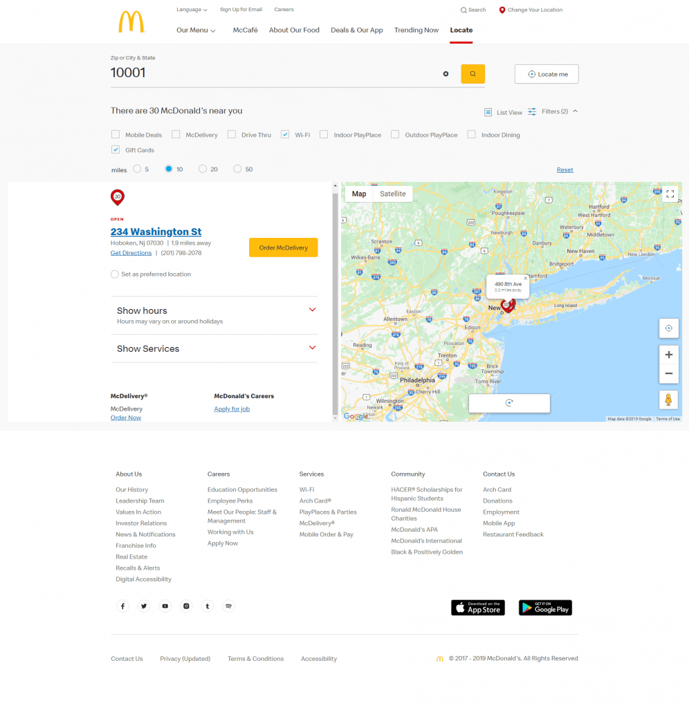
Each location in the list view provides brief info attached with the Order McDelivery button, which allows customers, in case they change their minds and want their meals shipped.
What we love:
- Google Maps integration: By clicking on “Get Directions”, customers are redirected to Google Maps site with completed starting point and destination (in a new tab).
- Advanced filter: Restrict the area to show searching results (by miles) or choose the services that you expect in the restaurant.
- Clean design:
- Other amazing features: You can pick your preferred locations. Phone numbers of each restaurant are clickable that allows customers to call directly, avoiding trouble with remembering numbers. Even recruitment info is also displayed in the store detail.
More tips to create an intuitive and beautiful store locator page
I hope that you can pick up some interesting ideas from the store locator examples above. However, each industry, each business model requires different features, functionality, and design. Here are several things that you can consider before building your own store locator page.
- Add dynamic maps instead of static images. Which solution is better: a small map with unclear details or the map that can be maximized full screen? The second one wins for certain.
- Display more helpful information on the store detail page: Store owners should update content frequently (contact info, websites, social links, etc.).
- Pre-load customers’ area when they visit your store locator page for the first time. It can even better to show the closest store to them.
- Use the geolocation API of the browser. Compared to IP-based geolocation, it helps you detect users’ locations more accurately. Remember to ask for their permission first because it’s related to their privacy.
- Test with many different styles to find out which one brings the highest effectiveness. Always keep your map clear and easy to understand.
If you want to have an impressive store locator page for your eCommerce website with minimum resources, you should use Magento 2 Store Locator extension by Magenest.
The extension creates a separate page to list all your stores with Google Maps display and helps your customers quickly find the nearest stores. With simple configuration, merchants can set up multiple maps to guide shoppers from online to offline stores easily.
In the product detail page, there is a list of stores where the product is available, which shortens the buying journey of customers.
Highlight features of Store Locator for Magento 2 include:
- Set up a filterable store finder for customers to locate your stores
- Store locations have rich details and directions
- Select featured or available products at individual stores
- Modern and mobile-responsive UI/UX design
- Set holiday for stores
- Unite stores with automatic map clustering
- Set the map color to match your brand
Of all store locator examples above, Plantlife built its page with our extension.
READ MORE: Top Magento 2 Store Locator Extensions
Some last words
The store locator page, working as a bridge connecting online and offline channels, becomes a necessity for the O2O model of any business of all industries.
In this blog, we have introduced you to the best store locator examples that you can follow to build your own page. We are eager to see yours! Feel free to share it with us in the comment section below.


