Want more subscribers? Boost conversions? Increase sales? No matter what you’d like to accomplish with advertising and marketing, you won’t do it without a compelling CTA.
Today we'll show you how to plan powerful CTA marketing tactics that boost conversion with some advanced tips to craft the perfect CTA.
But first...
What is “CTA”?
The definition of “CTA” - Call To Action, in essence, is an invitation calling people to take some desired action and how to take it. It is used from brands to brands with the aim of converting visitors into leads, prompting them to take particular actions.
Call to action examples are often seen in persuasive writing. Brands often include a call to action in a blog post or a video and usually in the form of a text with a hyperlink or a clickable button. Also, a call to action can be seen on homepages, right rail, or even above the navbar. For instance, CTA marketing can be two simple words “Buy Now” or a sentence “Want to learn more? Subscribe now to find out!”
A company will put them anywhere they know their readers are looking to invite them to subscribe, browse products, input information, or a number of other desired outcomes.
However, as with all marketing communications, certainly, there are effective and ineffective ways to plan the best CTA marketing tactics. So how to create a persuasive and effective call to action to increase sales or prompt your reader to leap into action?
Why is a call to action important?
CTA advertising is the opportunity to motivate your audience to take real steps toward buying your product and becoming your customer. It can be the determining factor that turns a lead into a conversion.
There are convincing reasons why the CTA button has become such a staple on-site content and in the ad copy. So why skipping the CTA is a grave mistake won’t bode well for your company? In other words, why is call to action marketing important?
Generate more sales
CTA improves your sales funnel by instructing users on what to do next and prompting them to take immediate action whether you want them to visit your blog, give you their contact, or subscribe to an email list.
Satisfy every customer
In some circumstances, customers expect to see the CTA when they finish reading the pages. That's when they may be interested in engaging with your brand and expect to do more by looking for the CTA button. You are not only disappointed and confuse your readers but also hurt your chances of sealing the conversion if CTA is excluded.
In short, it is arguable whether the call to action is the most important element of a site. Remember that a successful CTA marketing means higher engagement hence increased sales and strong customer relationships. Think of it as the line between bouncing and converting.
In fact, more than 90% of people who read your headline also read your CTA copy!
What Makes a Good Call To Action?
Eye-catching, brightly colored design
Ask yourself, will you notice an ordinary, undistinguished text or button in a long paragraph? Then, you will realize the foremost determinant of a call to action marketing is an eye-catching and brightly colored button clickable button or text with a hyperlink. It needs to stand out but still blend in with the rest of your site design.
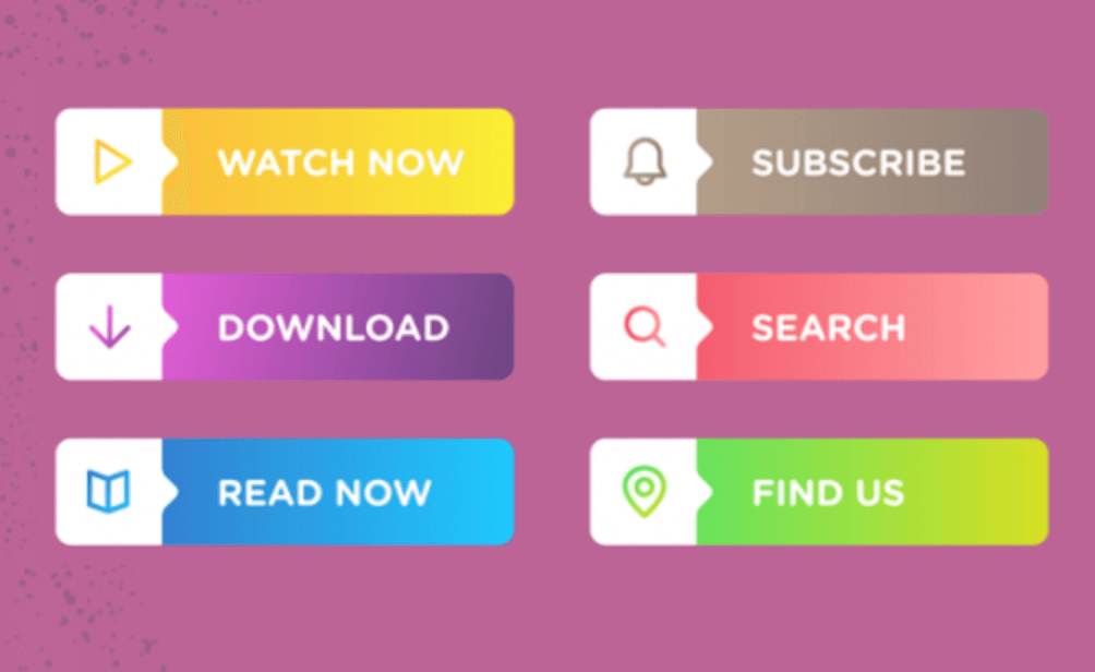
You can combine the elements such as fonts and brand colors but make sure the final landing page call to action really pops from the rest of the page. A highly contrasting design is key to an outstanding and eye-catching call-to-action.
Facilitate a smooth buying process by giving the people what they will easily be attracted to.
Clear, action-focused copy
Although enticing and creative is important, don’t forget to make it simple with clear and concise instructions. Take into consideration using jargon-free copy along with action words like “register" “download" “explore now" “ start".
You can browse leading brand websites to observe what type of actionable copy they’re using and let your inner copywriter emerge.
You can be familiar with popups as one of the most useful CTA advertising ideas, however, it’s a difficult task to create and manage each unique popup program. You want to save your time for other works rather than follow every action of your popups.
It’s time to find a comprehensive tool to support your advertising campaigns. Try Magento 2 Popup!
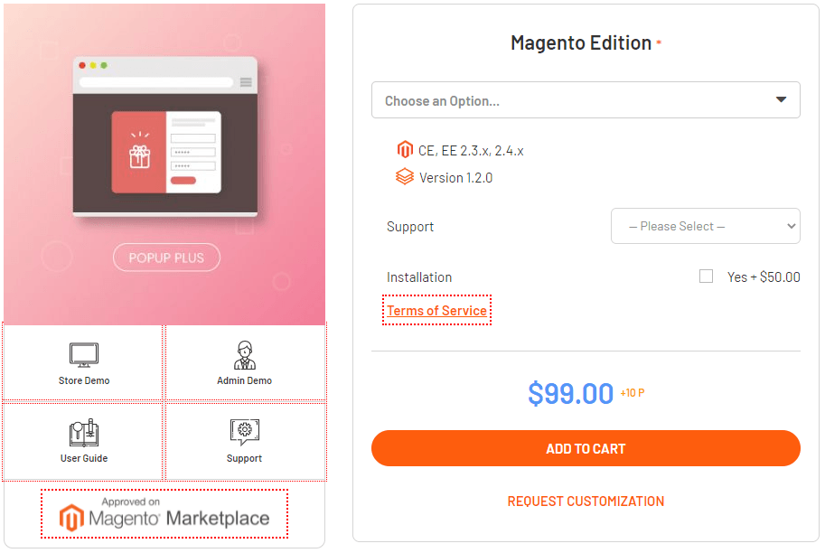
With our pre-designed templates, you can have beautiful popups in a fast and simple way. They are helpful to make customers focus on the exact content you want and drive their decisions with the best call to action elements.
We offer 5 popup types: Yes/No button, Social Sharing, Contact Form, Subscribe Form, Static Popup.
Include a sense of urgency
By adding the element of urgency, you can grasp your visitors focused on the specific action you want them to take. Few items left in stock? Limited offer? Promotion expiring soon?
Let your customers be aware to motivate them to act immediately rather than call it off for later.
Imply a bright promise
Shoppers hate being deceived or fooled into clicking onto something tricky that has no benefit to them at all.
Keep your call to action in writing always informative and make sure the copy explicitly tells your clients what they could expect in exchange for their click. Communicating the benefits of clicking on your CTA better!
Find a suitable and logical path to conversion
To make your CTAs more effective, mapping out your path to conversion to sew up a smooth and logical flow. For example, no new visitors want to buy a full-year premier delivery subscription because it’s too soon in their buying journey.

You need to align your CTAs with distinct and separate stages in the sales cycle so as to make relevant proposals and offers. CTA marketing that focuses on later-stage conversions can considerably benefit from a dedicated landing page that keeps distractions and confusion to a minimum, in improving the chances of conversions.
5+ CTA marketing tactics that boost conversion
#1 Offering the trial
“Forget freemium. Use a free trial instead.”
Don’t be hesitant to offer a free trial or a free ebook. There are several ways to convert these free members into paying customers through other means of marketing.
Research has shown that if you ask them to buy after their first encounter with your brand, 84% of them will bounce off your site. But with a free trial offered, conversions can be increased by 328%.
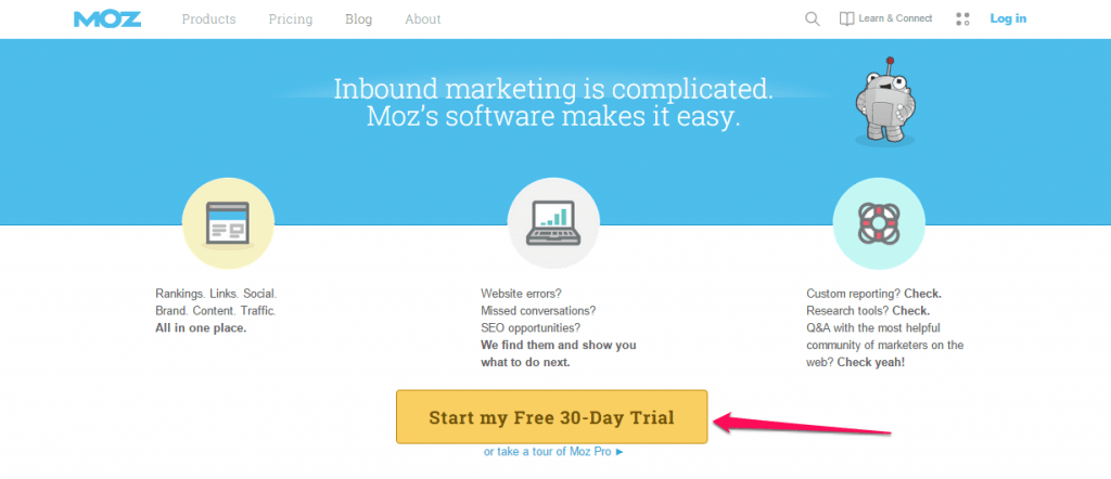
A lot of top brands regardless of their large customer bases, offer free trials to new visitors. Take Insightly.com, a popular CRM software service company as an example, you can see that it works especially well for organizations that sell software as a service (SaaS) because free trials are low-cost and easy-generated.
#2 Develop a Benefit-Oriented CTA
If you don’t want your click-through rate to suffer, your call to action has to offer certain forms of benefit to the customer. If people aren’t sure about the value that your CTA advertising button will provide, they’re not going to click it.
#3 Generate CTA with appropriate length
So how long can a call to action be?
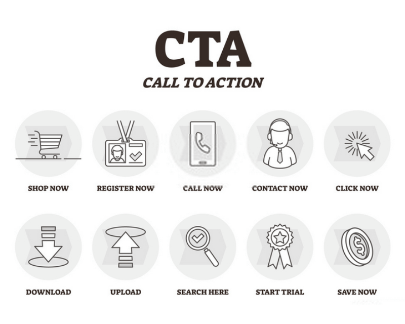
One word or CTA marketing seems to be popular and wide-used, especially with clickable CTA buttons. But can a call to action be longer than that? Absolutely, yes. It’s not uncommon to see CTAs that are only a few words long. There exists CTA advertising that is longer than one sentence. Sometimes a long call to action can work in your favor properly.
In general, your call to action should be clear and concise but that doesn’t have to mean ridiculously short. The brevity and directness of a well-written call to action in writing will put the focus on what’s important and eliminate any distractions.
#4 Place it at a good position
Where you locate your call to action marketing button will determine how many clicks it’ll receive from visitors. Normally, the best spot for CTAs is above the fold where your visitors look first without having to scroll down. That will usually be at or near the top of the page.
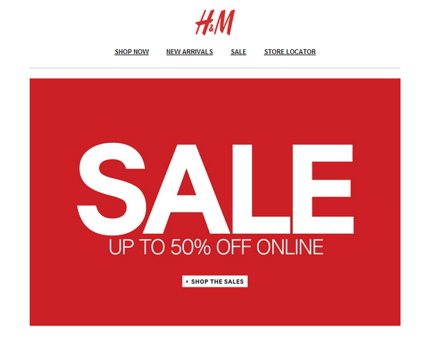
However, this depends mostly on your page layout. There’s no right or wrong to position your button on the site. The best recommendation is to do many examinations before making the ultimate decision.
#5 Convert the “No Thanks” button into your advantage
The No Thanks button isn’t always bad if you know how to use that as your advantage. This strategy will show you how to do this.
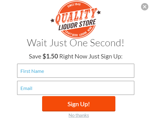
You can create a button for the main CTA while using anchor text for your No Thanks. Buttons signal a call to action should be colored with different brighter and bolder colors, meanwhile, a No Thanks button should be a neutral color. In this way, you can still draw more attention to your button CTA digital marketing.
#6 Let your customers feel the pain if refusing
To solve the problem of customers quickly refusing without a second thought, you have to make your customer feel the pain of saying no to you. This tactics called “confirm shaming".
Ask yourself this: what benefits are your visitors losing by clicking the no option rather than clicking the call to action marketing?
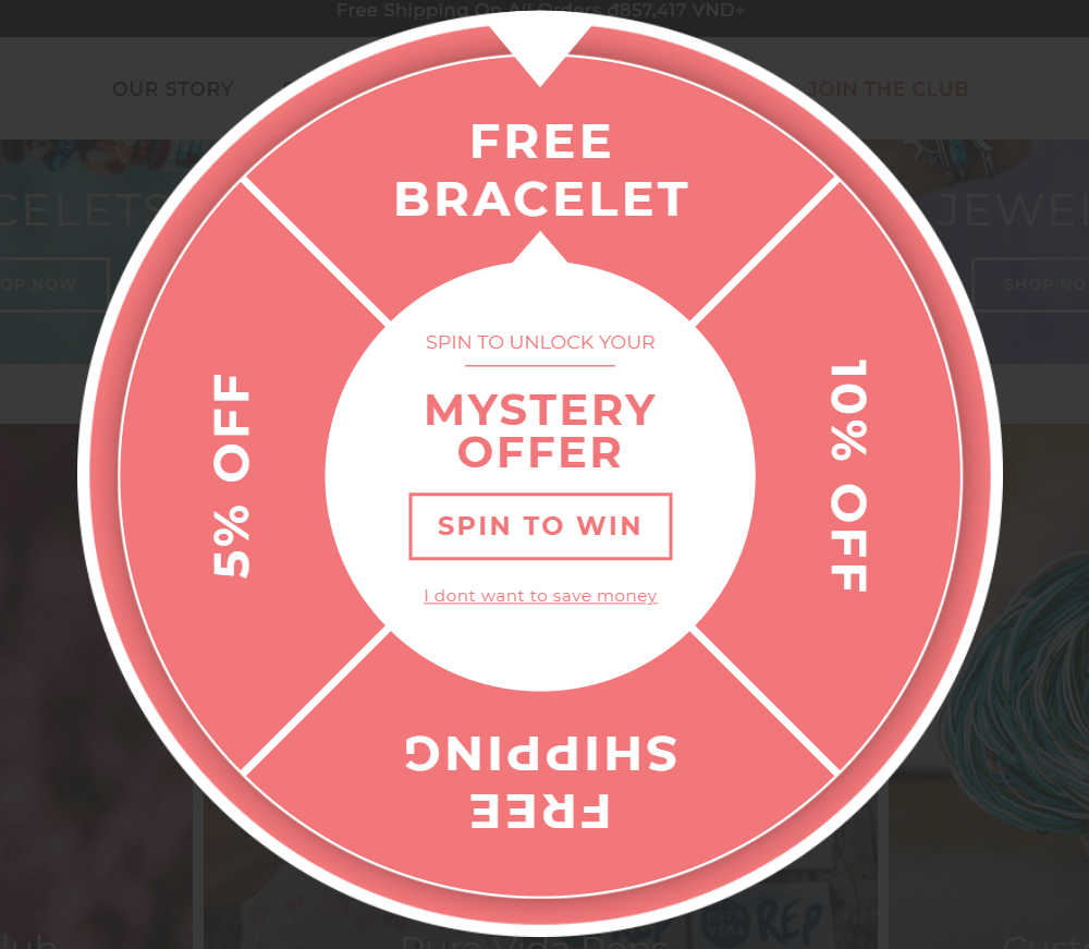
Take this example: On the win wheel popup, this brand tunes up the copy for their no button. Instead of basic “No, thanks”, they use the phrases “I”, “don’t”, “save money” to trigger the negative feelings in their visitor.
Who doesn’t want to save their money? Highlight the “I don’t want to save money” option to make them feel difficult to refuse.
Final thoughts
This in-depth article has been written with you in mind - if you want to discover how to write the best call to action that’ll captivate your target readers and boost your conversions.
In short, one of the principal reasons why most landing pages and sales pages are not converting leads into customers is an ineffective call to action with no sense of urgency. None of these basic CTA marketing triggers will probably get you the desired result, because your target readers are more knowledgeable than ever before.


