Did you know that eCommerce pop-ups can help to increase your subscription to 86% and sales by 126%?
Imagine a customer browsing our website for a while and get lost in a wide range of choices, a pop-up that suggests a bundle of products based on customer’s behaviors will help to seal the deal on the spot!
And that’s not the only thing an eCommerce pop-up can do.
Pop-up can come in many forms and shapes, serves different purposes, and brings about the great outcome. Interested in improving your sales performance by using pop-ups now? Read on to find out!
What is an eCommerce Pop-up?
Pop-up is a small window that appears on your website to prompt customers to take action. It can be a welcome message, a Call-to-action to subscribe to the newsletter, or a discount code to guide customers down to your funnel.
Why would you want eCommerce Pop-ups?
You might be wondering how effective pop-ups can be and if it is worth the effort? The answer is a big YES! Here is why.
Boost sales
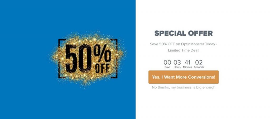
A pop-up with a timer saying “your offer will expire in 5 minutes, hurry up!” will create a sense of urgency that urges customers to purchase the products within the designated timeframe. It taps on the psychological reaction that a good offer is limited and if you do not hurry, you are losing your chance to save money.
Besides, an eCommerce pop-up to inform your current flash sales or seasonal sales also bring in quick revenue, in a few days, if not hours.
Grow your email list
A study by McKinsey & Company found email marketing is 40% more effective than other social networks. The conversion process is also 3 times faster. So having a pool of your targeted customers’ emails means you are close to driving your customers down to your funnel.
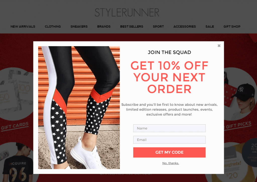
That’s why growing your email list is extremely important in today’s marketing. And eCommerce pop-up can do a perfect job of collecting emails from potential customers. A 10% discount code in exchange for a life-long contact isn’t a bad deal at all, is it?
Generate leads
To grow your business, you need to reach as many new people as possible and nurture them into customers, or frequent buyers. That’s where pop-ups step in to help you generate more leads.
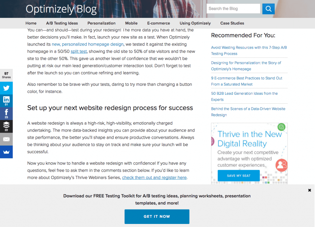
This pop-up doesn’t interfere with the current content, the offer is tempting and clearly said. A “Get it now” is a straightforward call-to-action prompting the customer to click and find out what it has to offer!
Promote an ebook or a blog
A pop-up is an attention grabber. If used well and at the right time, it can keep people engaged with your content and ultimately drive them to buy your products or read other relevant content on your website. Here is an example:
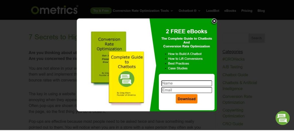
Ecommerce pop-ups to engage with your customers
eCommerce is getting more competitive, if you don’t differentiate yourself from the others, you are bound to be forgotten. eCommerce pop-ups can help you bond with your customers in a very unique way.
Say, your customers are browsing on your website to look for some products. With the database available, you know your customer’s birthday is within this month, why not send him/her a Happy Birthday Pop-up saying you are more than happy to send them a gift card for this purchase?
Not only can you sell, but you have also potentially turned him/her into a loyal customer for good!
4 types of eCommerce pop-up for your business
Different types of eCommerce pop-up will help you interact with customers in a friendly way, not being too intrusive or pushy. You just need to understand when to use what.
Welcome pop-up
A welcome pop-up comes in as soon as customers visit your site.
It’s a friendly way to say hello to your customers and let them know you are there to help and what you are offering. You can coordinate it with an email subscription box to stay in touch with your customers and offer a small gift in return.
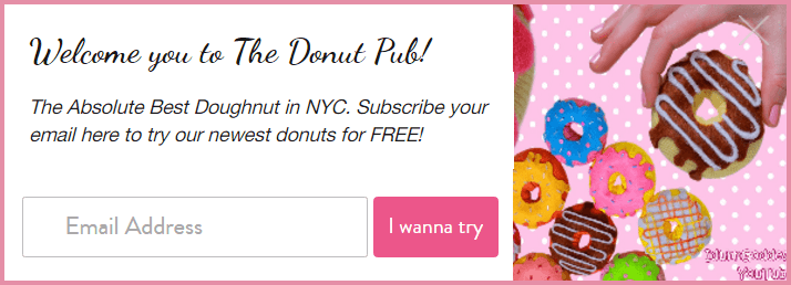
Coupon pop-up
Discount is a powerful weapon to entail customers and keep them accompanied with you in the long run. Bear in mind that coupon pop-up could sometimes drive your customers away if it tends to be disruptive. So make sure it’s designed with a close mark/button so that customers can easily close it off. Also, only present a coupon pop-up if it’s a special deal, not just a top item or a full-priced product in your store.
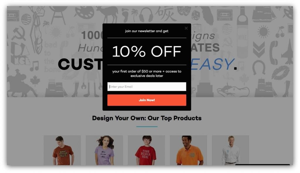
Cross-sell and upsell pop-ups
Cross-selling and upselling help you sell more without sounding too pushing. It also adds value to customer experience. Unlike an offline store where there is a salesperson to guide customers during their purchase; with online shopping, customers are on their own. However, you can step in to help.
A pop-up to suggest an upgrade product (upselling) or an add-on item (cross-selling) helps customers easily spot relevant items without opening a new window to browse. You have more revenue while keeping customers shopping at ease. A win-win situation.
Exit-intent pop-up
The abandonment rate in 2020 is at 88.5%. It means that of all 100 customers who add products to their carts, only 12 people make a purchase. However, there is still room for improvement and the use of pop-up is one of the solutions to lower this rate.
An exit intent pop-up can work perfectly well to remind the visitors what they might be missing out on: a 20% discount, a halfway to receive a ticket to the concert, a click away to receive a good deal from buying your products, etc.
Here is an example:
READ MORE 6 Best Exit Intent Popup Examples to Boost Conversion Rate
8 Tips for the best eCommerce pop-up design
It’s undeniable that many people may find eCommerce pop-ups annoying and interrupting their purchase. That being said, data also shows the average conversion rate for pop-ups is 3.09%. It sounds insignificant at first, however, imagine if you have 100,000 visitors to your website, you can get 3000 subscribers!
Isn't it good enough to start working on the pop-up for your business?
If you are unsure of the Dos and Dont’s. Here are some tips to guide you through the process of creating the best pop-ups that turn visitors into customers.
Urgency and countdown element
As said, the time constraint to purchase something prompts us to make a decision quicker as we tend to fall into the “FOMO” trap - The fear of missing out. You can add on the number of items in store and the number of people looking at this item to make your customers aware this product will be out of stock soon, take an action now!
Emotional impact and privilege
Tapping on the emotional side of customers is a great way to engage with them.
This pop-up is not only attention-grabbing but also irresistible with a picture of a cat. The offer is also tempting, you wouldn’t want to miss 30% off your bill, right?
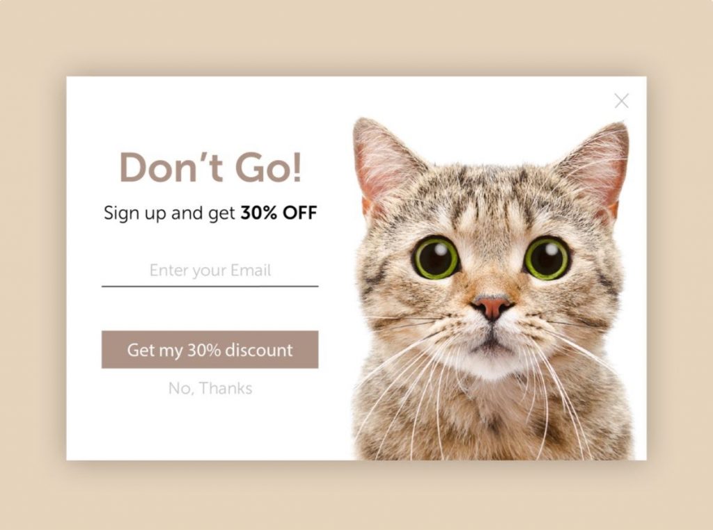
In another scenario, if you want to learn more about your customers, add on a box or a short survey saying “We are sad to see you leave, let us know how we can help!” This is a nice gesture to show you care and you want to improve your customers’ experience.
Personalize the pop-up
A pop-up is a mere disturbing window if it is not meant for you. One of the ways to personalize pop-ups is to call out their names, they wouldn’t want to miss information specifically sent for them!
“Hey Sarah, you forgot to subscribe to be the first check out our new products”
“Wait, Sarah! Check out NOW and get Free shipping just for you.”
Responsive on mobiles
Research shows that 70% of users purchase by their phones. Thus the mobile version of a pop-up should be a top priority to pay attention to. Make sure the pop-up doesn’t take up all space on your screen as it appears to be disrupting to many users. Here is a good example of how it should be displayed:
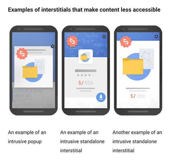
Magenest is offering the pop-up design that is responsive to mobile. You might want to check it out here!
Optimize the key elements of an eCommerce Pop-up
If you are excited to roll up your sleeves and create your own eCommerce pop-ups but wondering what is included and how you can optimize it, here is the guide for you!
Context
Ecommerce pop-ups can be counterproductive if it’s irrelevant and interfering with customer’s activities on your website. So pay attention to when and how it should appear. It’s worth noting that you are offering something value-added and at the right time when customers feel like they want to get more information on their interested topic.
User-friendly copy
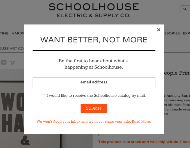
The content presented on the pop-up should be on-point, concise, and catchy. State what you have and what you want your customers to do. The tone of your words should align with the targeted customers. You wouldn’t want to say “Hey lovely! Stay updated with our beauty tips and exclusive products here!” to middle-aged customers.
Here is an example:
Design, it matters
How you design your pop-up is a key factor to win customers’ hearts and attention. The pop-up color should tone with that of your website. Visuals create a pleasant feeling and keep your visitors hooked to read on what is in the pop-up window.
Call-to-action
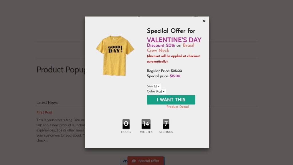
A call-to-action is a must in a pop-up. Explicitly state what and how you want your visitors to react. The contrast color of the CTA button and the background certainly will draw people’s attention.
Wrap up
Pop-ups can be a double-edged sword if you don’t know what and where to start. We hope this will shed some light on the process of building a pop-up for your website as it’s proved to be worth it. You can craft beautiful pop-ups in a fast and simple way with our Popup extension for Magento 2, juggle around with well-created templates and additional features such as countdown, data tracking,... then just wait for your sales to roll in!


