Of the most common factors in website navigation design, "Mega menus" are the most useful tools to guide users on how to subordinate pages.
Today, without a mega menu, many online stores, and eCommerce websites would become incomplete. Yet the biggest retail websites, such as Amazon or eBay wouldn’t be successful without help from their mega menus.
This article has gathered some cool mega menu examples. Some have stunning design details, and some have smooth and dynamic interactions.
Let's begin!
What Is the Mega Menu?
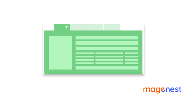
The mega menu (or megamenu) is a two-dimensional expandable menu. You can see a mega menu sample:
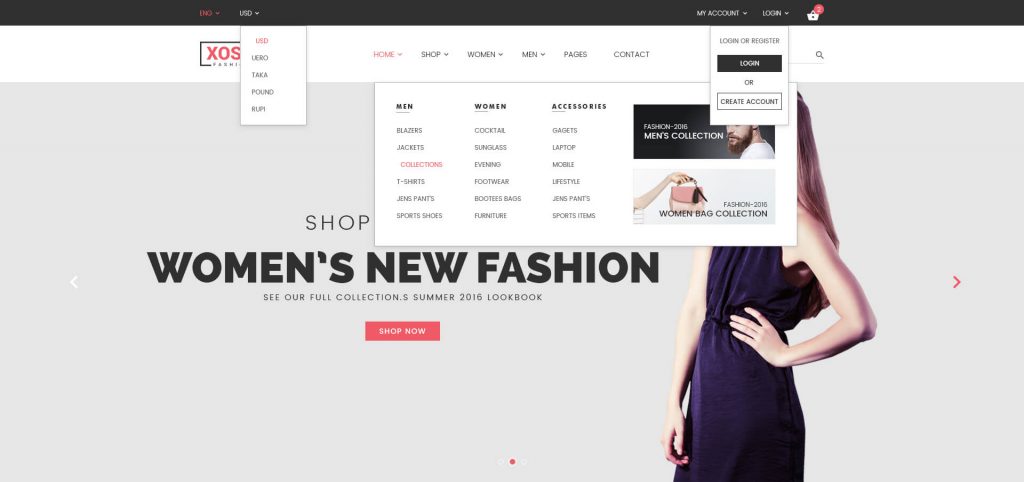
They’re highly effective if you have a long list of subpages and menus because it would be cluttered and hideous if a lengthy menu was exposed as a single, top-seated menu.
With a mega menu, no panning or scrolling is needed as all major options are visible at one time. It can be horizontal or vertical, depending on your industry and design preferences. The additional menu options can be revealed when you click, tap or hover. This contributes to a more appealing and expansive menu system.
Why are Mega Menus so Helpful for eCommerce?
Today, websites tend to cover more in-depth topics and categories; and the mega menu offers visitors the ability to "dive into" with no difficulty in finding relevant content.
Mega menus offer an improved user experience
Concerning some eCommerce mega menu examples, there are thousands of products in different categories with granular databases supporting the offerings such as categorical data, product specifications, related items, product reviews,...
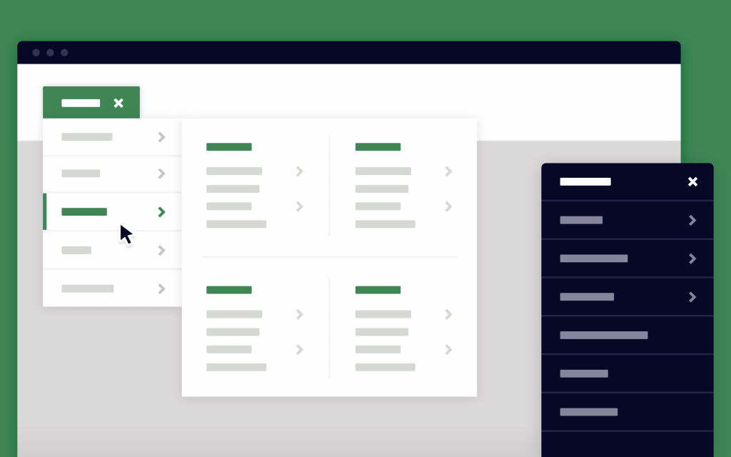
Mega menus allow visitors to quickly see all categories, rollover attractive ones, and then drill-down into the appropriate data with superior imagery and interactivity to smooth the navigation process.
The earlier "fly-out" menus can't offer the same level of benefits.
Mega menus offer a better-indexed site for eCommerce SEO
If a search engine begins to index a site, it has to find the links to all the content on the site as soon and efficiently as possible. As unlikely may it seem, search engines have limited resources for indexing sites and keeping their record of which is up to date.
A mega menu, which offers a clean, yet in-depth set of links at the top of each page, enables search engines to easily and promptly index site content without having to cull through thousands and thousands of words of dysfunctional (to the Search Engines) HTML and JavaScript code.
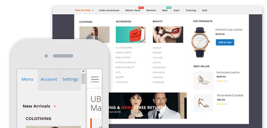
Create Mega Menus for your eCommerce website now if you don't want the eCommerce world to leave you behind. One of the fastest and easiest ways to incorporate a mega menu is to adopt eCommerce extensions from the online marketplace.
You are absolutely lucky if you are running a Magento site because there are many useful Magento extensions that can help you build a well-structured mega menu.
Try our product: Magento 2 Mega Menu extension now!
Magento 2 Mega Menu is a beneficial tool to design and optimize menu layouts with flexible options. This extension boosts your Magento store to win more attraction, increasing customer’s experience with ease.
A multi-level menu can be developed using drag & drop or hyperlink, you are also free to add pages, categories, or custom items to your menu.
Moreover, the menu can be customized with different colors, background images, and labels with HTML and CSS. Live preview for label editing can be a brand new experience for you.
10 Best mega menu examples in 2024
Here is a list of mega menu examples from some leading brands, which has gained huge profit from the mega menu efficiency.
#1 Moosejaw
Moosejaw.com is an online brick-and-mortar merchant specializing in outdoor casual wear, rock climbing, snowboarding, hiking, and camping gear.
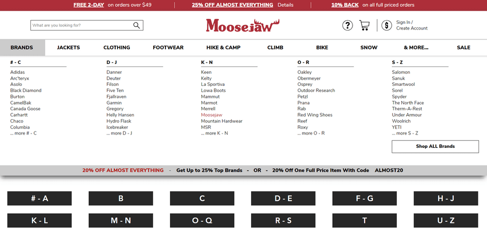
Moosejaw website's mega menu lists the different available categories as comprehensively as possible. The second-stage classification is divided into age, gender, and the product, which is a very typical detailed eCommerce menu.
It’s one of the mega menu dropdown examples since the design is as contrasted with the header and the rest content of the website. All the information must be organized with headings in a proper manner, otherwise, it may contain each and every data about a specific subcategory.
#2 Quiksilver
Quiksilver is an Australian sports brand. It is considered one of the world's largest surfwear and sports-related equipment brands.
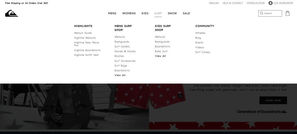
Its website adopts the large-scale mega menu that matches the minimalist style with the centered menus, large whitespaces, unified black font. bolding and capitalizing hierarchy.
#3 Starbucks
Starbucks Coffee Company is reasonably the most well-known coffee chain in the world.
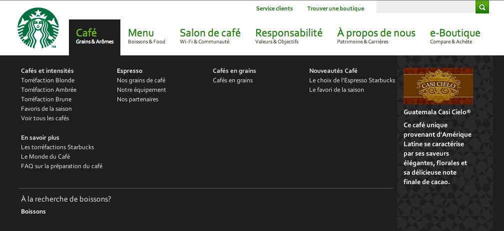
Starbucks is using a well-designed mega drop-down menu with several CTAs (Call to Actions).
Each menu is in the same width but different height and follows a strict standard page grid. The style blends in with the site design, and the generous whitespace makes it easy to read.
You can take this as mega menu design examples to design your own one.
#4 Adidas
Adidas is the largest athletic shoes, sportswear and sporting goods manufacturer in Europe.
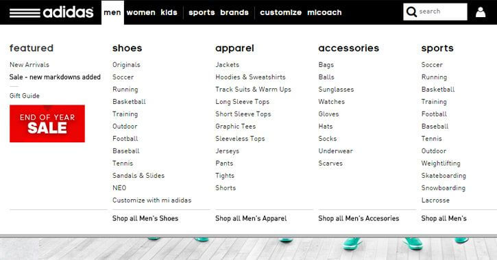
Its drop-down mega menu is covering most of the page and it vanishes when you move your mouse (hover) away from the particular category.
#5 Estee Lauder
Estee Lauder is a very popular brand, famous for its cosmetics products.
The mega menu makes good use of the simple design style of black text on a white background with large pictures.
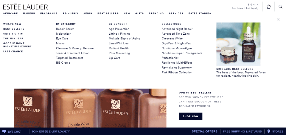
Different customizations enable you to create a distinct kind of drop-down menus.
#6 Walmart
Walmart is one of the world's biggest retailers, known as the American operator of discount stores.
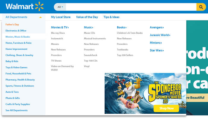
Drop-down menus are admired by all the visitors as they offer a unique navigation experience to all the users visiting the particular site.
#7 Toys R Us
Toys "R" Us is an international toy, clothing, and baby product retailer. Here is its mega menu sample:
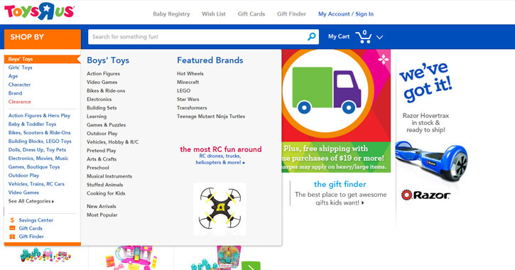
The drop-down menus can cater to a variety of stuff like images, videos, pages, and a lot of other stuff that requires the attention of the visitors.
#8 GNC
GNC (General Nutrition Company) is an influential retailer of health and wellness merchandise.
For mega nav examples, you can see its mega menus have convenient categories such as “Popular brands” and offer vital user experience.
#9 Evernote
Evernote is a leading electronic note-taking data management software.
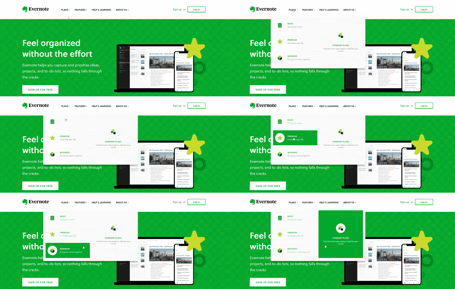
The entire site is very consistent green. In the mega menu, if the mouse is over to the secondary menu option, the rest of the other option sections will turn green.
#10 FAO Schwarz
FAO Schwarz is an American toy brand prized for its high-end toys, life-size stuffed animals, interactive activities, and games. The mega menu design examples are:
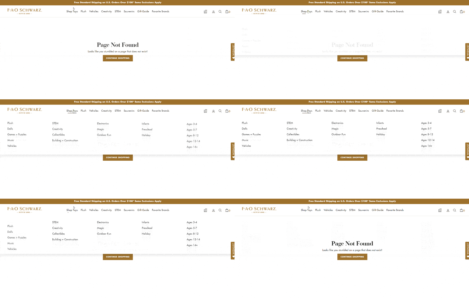
The website is one of the perfect mega menu examples, which is very engaging, utilizing dynamic effects from top to bottom, left to right.
Wrapping up
Above are the mega menu examples, and they will be design trends that stick around for a long time.
Since the trend shifts to mobile and responsive design, companies will need to make more user-friendly navigation panels. And a mega menu is an efficient and cost-effective way to make multiple categories and options easily accessible for users. It will be the top navigation solution for retailers.
However, it’s critical to analyze the design and presentation of menus to avoid the possible drawbacks.
Hope you find this article with the best mega menu examples helpful!


