For an eCommerce business, every page on the website is equally important. You cannot ignore your homepage since it’s the first impression of your store. If you forget to invest in the product detail page, well, buyers will not understand what you’re selling.
And then we have the product listing page. Some retailers just put everything into the page and consider it’s done. However, it takes more effort than that to create an engaging and effective category page.
Let Magenest gives you an introduction about the hidden yet huge potentials of the product listing page!
What is a product listing page?
The product listing page, also known as the category page, is a page that can list:
- All your items
- The products within the same brand
- The products with similar features in style or price.
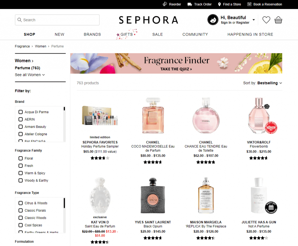
An individual product will be represented by one or several photos, underneath is its name and price, some stores also show the ratings.
This page gives customers a quick introduction to the variety of your products and an overview of each item. It acts as a door between the homepage and the product detail page so customers can enjoy a seamless shopping journey at your store.
You can get access to the category page from many places on the website, such as the menu, category navigation or tags. All these pages have a filter or sorting tools to support customers’ process of finding the most suitable results.
How the product listing page benefits your sales
Focus on a particular category
Customers may get lost in your store if they cannot find a clear direction to their wanted items. This is when category pages rise and shine to make the shopping journey much simpler.
With just a click, customers can see your part of the store dedicating only to their demands. For example, entering a fashion online shop can be dreadful if you can’t see the women and men category anywhere on the page. How you can choose what to buy, or even just what to look for?
Paying attention to one specific category is beneficial for both sellers and buyers.
For store owners, they can create a consistent and effective site structure as well as maximize the potential of their products. This is a great way to increase the quality of customer services and the performance of online stores.
For consumers, they don’t get distracted so it’s easy to find suitable items.
Prove your product diversity
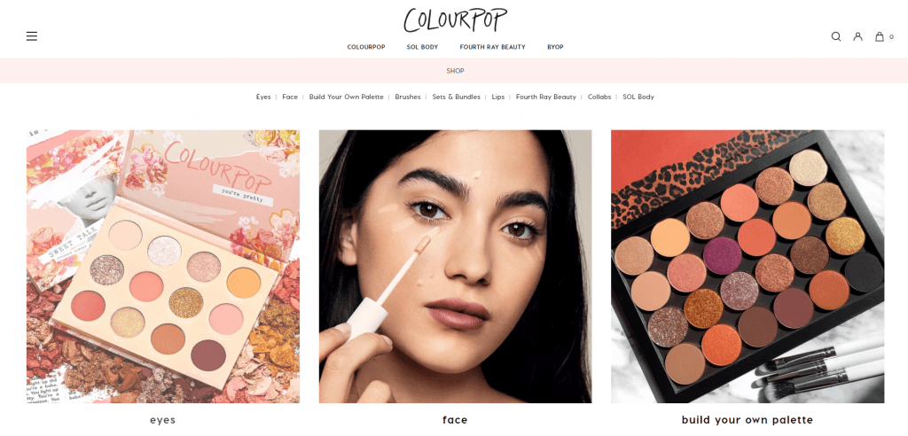
As its name suggested, a product listing page is where you showcase all products after classifying them into different groups. Customers don’t know whether you have a wide range of items or not, and a store that lacks variety cannot keep up with the movement of the eCommerce world.
So making the most from the category page is an amazing way to prove your diversity to consumers. A page full of high-quality products will definitely make customers trust your store more!
Personalize customer’s journey
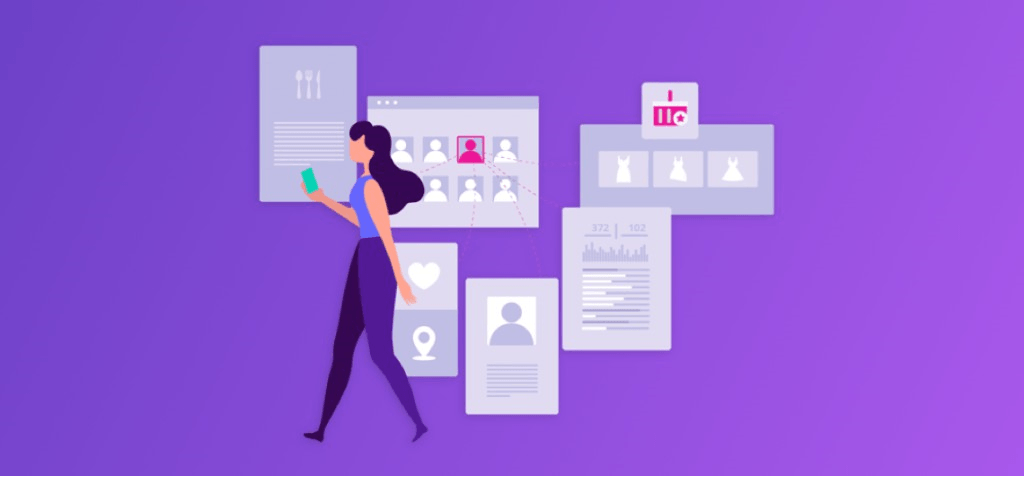
Moreover, thanks to the sorting system, customers can look for the items based on their needs on product listing pages.
The category page has already concentrated on a particular field and customers can be more specific by applying filters to narrow down the results. This reduces a huge amount of searching time and creates a satisfying experience for visitors.
Support the decision of customers

As the page presenting all relating items, the product listing page can support consumers who are unsure about what they want. They may have a general idea about their choices but need more evaluation and comparison to make the final decision.
What’s a better place to do this than the category page?
Customers can search, filter, and pick their suitable and favorite results. They can compare different products since each includes basic information for customers to choose the potential items.
How to utilize 100% of your product listing page
[#1] Make use of CTAs
CTAs, or Call-to-Actions, are extremely effective to encourage customers’ interactions with your brand. There are may popular CTAs at the moment like popup, button or banner.

It’s a smart move to use these CTAs to promote your flash sales: Banner slider can appear everywhere on the page to show information about the special deals or previous customers’ reviews, while popups can make them engage with your products quickly.
Having different designs and CTA set for each category page, customers can easily aware of the advertisement and be ready to join discount programs.
[#2] Pay attention to your header
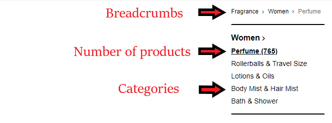
Let’s be fair, usually, we just pick the products on the Above-the-fold part; we rarely scroll down to find more when we’ve spotted ‘the one’ we’re looking for. It’s necessary to put all the important features on the header of your product listing page. Here are some suggestions for you:
- Breadcrumbs navigation: To show the road leading to the current category page so visitors can understand more about what they’re searching
- Numbers of products on the page: To notify customers of the number of items they can see on the page per search
- Category: To emphasize what customers are exploring, also it supports a good site hierarchy.
- Sorting options: To organize the search results in orders such as by date or price
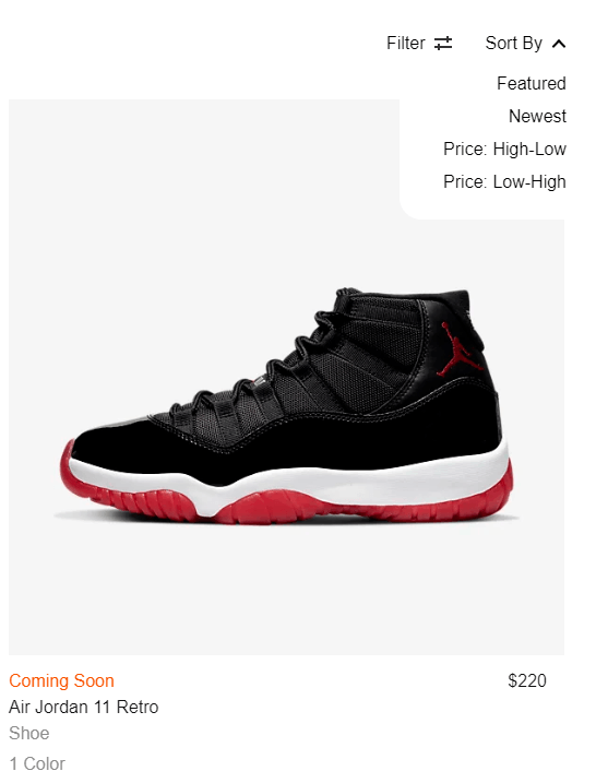
- A short description: To give an overview of the category so customers can decide to research further or not.
[#3] Create a smart filter system
For a product listing page, filters are the must-have function. Even after entering the page, customers still want to receive the least possible results. Filters can eliminate irrelevant searches for users. By ticking on checkboxes or moving the slider, you can build up your own set of conditions.
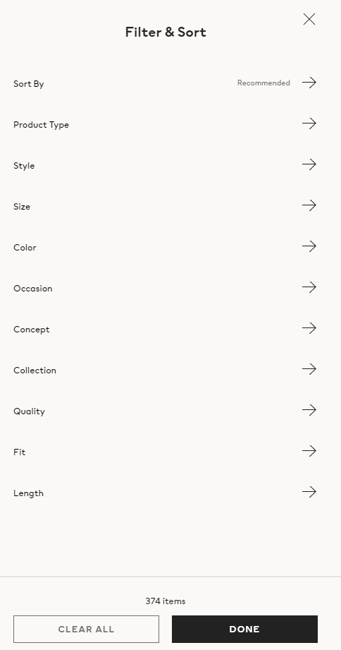
Retailers should come up with enough conditions to serve the needs of buyers. This will make the customers more satisfied with your services and expand the influence since filters create a personal experience for each user.
[#4] Optimize your product images
Images can be the most impactful factor in the decision of customers. So it takes a little effort to create s strong visual impacts. At first, you need to choose the resources carefully. It can be photos, gif, or a short video.
However, you must make sure that everything is of the same size and high quality. Besides your eCommerce platform, your store will also be displayed on mobiles so pay attention to the resolution of your photos on the category page.
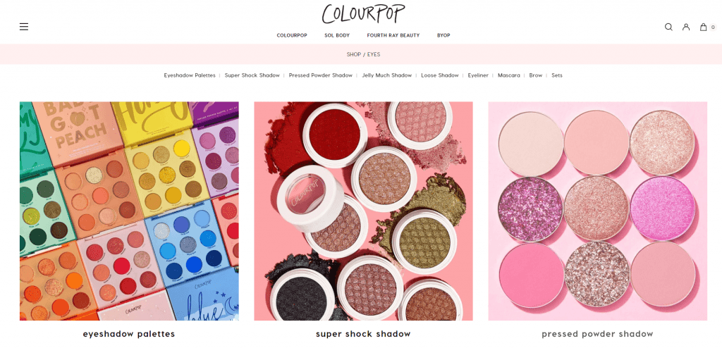
When hovering on the picture, customers can see the next one and get a multi-dimensional view of the products. Admins can freely adjust the speed and the animations applying for each photo. Furthermore, this extension is highly responsive to many devices so you don’t have to be worried about an inconsistent shopping session.
[#5] Highlight pricing and rating
A reasonable price is a good reason to buy a product. That’s why on the category page, store owners show the price of each item.
You can also show a discount price next to the original one if you’re running a promotion campaign. This design gives customers the urge to buy immediately since it will be a beneficial deal for them.
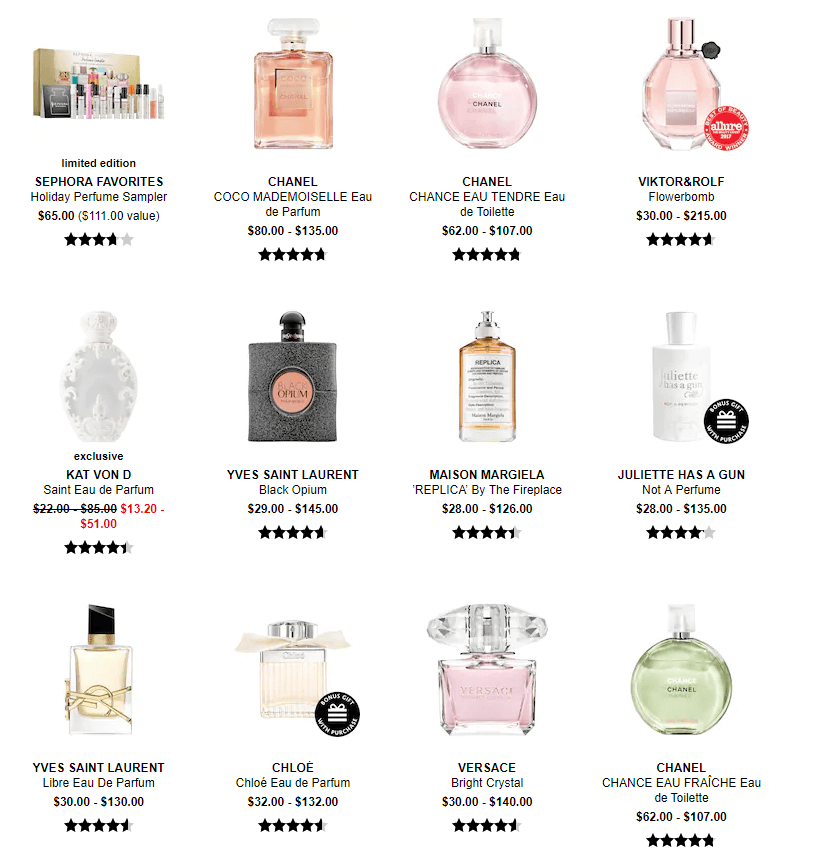
Besides, you should list ratings and rewards points under the price. Ratings present a real interaction of customers with your product, while rewards points show what they earn for the loyalty program if they actually buy it.
[#6] Create a shortcut
Some customers may decide right away to purchase the product on the category page. So why not create a shortcut by adding the Add to cart button at each item?
This will simplify and speed up the shopping journey for buyers and prove the dedication and well-thought design of your store. Visitors can also click on the breadcrumbs navigation to come back to the previous points.
In conclusion,
Understanding how to optimize an engaging product listing page is an easy way to increase the performance of your store. So get ready for the new changes in running your eCommerce business after upgrading the category page! Our tips will definitely bring a new kick to your development as well as the website’s design.
Visit Magenest for more tips and insight about the online shopping world!


![How to create a new product type in Magento 2 [Step-by-Step]](https://store.magenest.com/blog/wp-content/uploads/2019/05/create-a-new-product-type-in-magento-2.jpg)
