In this day and age, when you move the mouse quickly outside the active area, towards the back button, a website will be able to sense you are about to leave and immediately display a last-minute advertisement, with the help of Javascript.
These ads, referred to as exit intent popups, are some of the most robust and timely tools in a digital marketer’s arsenal. While they may take after popups from past experience, they are considered a completely different tool (if used precisely).
So what is special about exit intent popup? Find out now!
What is Exit Intent Popup?
An exit intent popup is a powerful technique applied in online shops and websites with the purpose of retaining visitors that are going to quit the site.
Exit intent technology, along with the detection of exit behavior of an internet user, was invented and patented in 2012 by Ryan Urban, the CEO of BounceX.
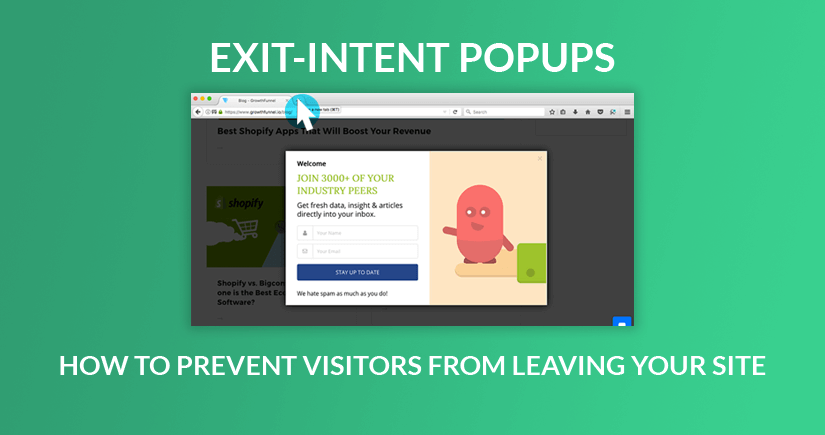
This popup will track every visitor's mouse movements, and if the mouse pointer moves outside the upper page boundary, which is the location of the tab bar, a popup window will show up. The advertisements are triggered by using a JavaScript snippet that measures the direction and speed of the mouse. Exit intent popups ensure that the user experience is retained until the last second, which is different from other popups that can appear at any particular moment in time.
Regularly, the popup carries a discount code to persuade people to finish the sale. Exit intent ads can also be utilized to collect emails, offer a discount, segment to a newsletter list, or push to a demo.
READ MORE 5 Dominate Types of Popups You Should Have on Your Website
Benefits of an Exit Intent Popup
An exit pop up will provide you with some wonderful benefits. To name a few:
#1 Boost Conversions
There is no other pop up that captures as much the visitor’s attention as an Exit Intent Popup. The productiveness of popup doubles when it is demonstrated to the user when they are only eager to take an exit. It is not similar if the user is browsing some other stuff and is suddenly interrupted by a popup.
With exit intent popups, you can diminish the cart abandonment possibility and in the end, increase your conversions.
#2 Reduce Bounce Rate
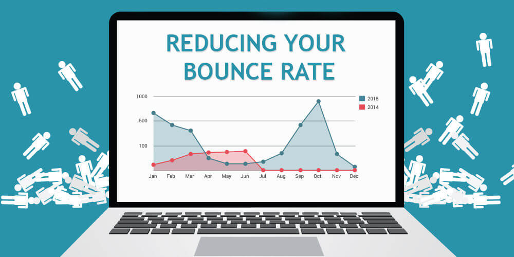
When a user lands on your site and does not find anything that matches their needs, most likely they will immediately bounce off. And during the short interval when they try to leave, an exit intent popup could encourage them to stay and further check your website out.
#3 Not highly disturbing
Pop-ups often have been an extreme annoyance for users. They are considered to hamper the user experience. But the same could not be said with Exit Intent Popups because they only show up when the user has already got the decision to leave your website and there is nothing terrible in making a try to prevent them from leaving.
Exit Intent Popup Best Practices
Let’s take a look at some of the best practices for an exit intent popup to obtain positive results.
#1 Bring up Irresistible Offers
The best approach to prevent your visitors from abandoning your website is by offering them some stuff which they can’t resist grabbing.
It needs to be something that is really exciting. It should be worth their consideration and should stimulate them to immediately claim that offer. If the offer is not exciting for them, the pop up will flop against bringing conversions.
#2 Make it Visually Appealing
If you want to make a difference with your exit intent popup, make sure it is highly fascinating, engaging, and designed in such a way that users are not offended by the interruption and feel the need to take a look even if they have already decided to leave.
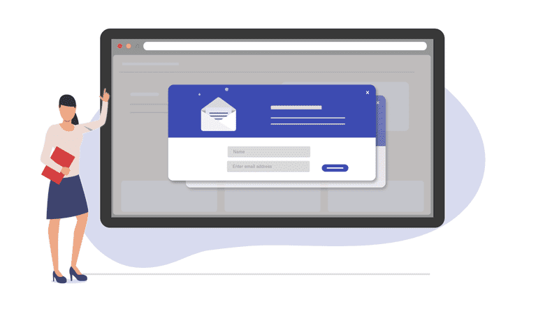
Use attractive color combinations, keep an eye on what font you are using, produce tempting content, and much more than anything else, design your outstanding CTA. Yet, do not use common CTAs that we see every day everywhere like Subscribe or Sign Up, use the ones that bring us some urgency.
#3 Use it to Gather Feedback
Exit Intent Popups are also adopted to get the feedback of the visitors. Ask them if they have any suggestions to give or have any complaints to make or anything that they think is missing or lacks and needs to be improved.
If you are currently running a Magento-based website, you may find it pretty simple to design an exit-intent popup since there are various helpful exit intent popup Magento extensions.
One of which is Magenest's Magento 2 Popup which helps you create appealing popups in a quick and simple manner, at the same time, attract customers to the specific content you want and encourage their decisions with CTA elements. We offer multiple pre-designed popup templates based on your resources to simplify your workload, including exit intent popup. Then, improving sales is in the palm of your hand!
6 Best Exit Intent Popup Examples to Boost Conversion Rate
When you’re deciding on an exit intent offer, it’s necessary to get in on a visitor’s head. Think of the reasons why they first got to a page, how they reached there, and what they’re expecting. Once you have that mindset, then you can start with identifying the best offer to them that helps converting and also preventing a bounce from your site.
Here are some best ideas of exit intent popup examples:
#1 Shape your traffic
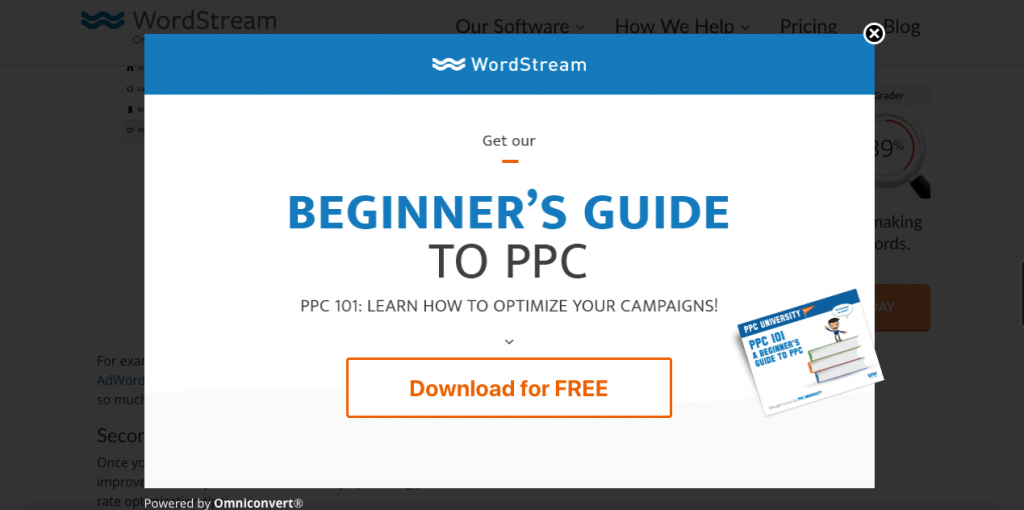
Word Stream promotes their e-guide titled “Beginner’s Guide to PPC” on their exit intent popup window, which is considered one of the best exit intent popup.
By identifying what URL you’re browsing, they dish out a piece of content that they think you’ll like. Their intent of this advertisement is to make a visitor keep reading inside the area and then to funnel them to a higher converting landing page (which in this situation is an e-guide). A more extended time-on-site and additional page views per session can improve site SEO and hence increase the conversion rate.
Believe it or not, but a study conducted by Wolfgang Digital has shown that by improving time on site by 16%, conversion rates effectively ramped up 10%.
#2 Launch a quiz
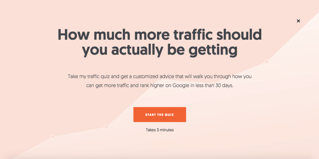
Neil Patel is a maestro at conversion and SEO optimization — and its exit intent popup design is an excellent example of why. He provides a headline that catches his readers’ attention right away (most of whom are digital marketers). He later gives the explanation for why you should take his quiz and gives a time value for how long it will need.
By taking that quiz, Neil can successfully identify leads and convert better what would have been dropped traffic. A quiz is an exceptional way to increase time-on-site and decrease bounce rate.
#3 Launch a contest
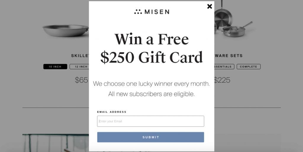
Misen uses a competition to expand their email list and collect the leads of potential buyers. Everyone loves free stuff, and the possibility of winning a sizable gift card is high enough to get many visitors to provide their emails. This is a captivating strategy since it enables Misen to grow their list without freely giving away shipping or marketing their products at a high discount.
#4 Provide a custom offer
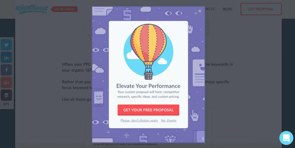
Look at one of the exit intent popup best practices! KlientBoost offers their visitors something that looks really distinctive and attractive on their exit intent popup: a customized proposal.
They hint at what is going to be involved in the marketing proposal and make the offer seem to be personalized straight away — even if it’s not.
#5 Collect emails

Hubspot uses its exit-intent popup as one of the means to collect new subscribers for their email list. They discern that if y’all read a certain volume of posts on their site, you’re taking a liking to their newsletters.
Then, they back up the quality of their content with the headline, for example, “Join XXX,000 Fellow Marketers” — adding a little bit of social proof on the mix. As in the above illustration pic, if 215,000 have already joined their email list, shouldn’t you the same thing?
#6 Offer Customer Service
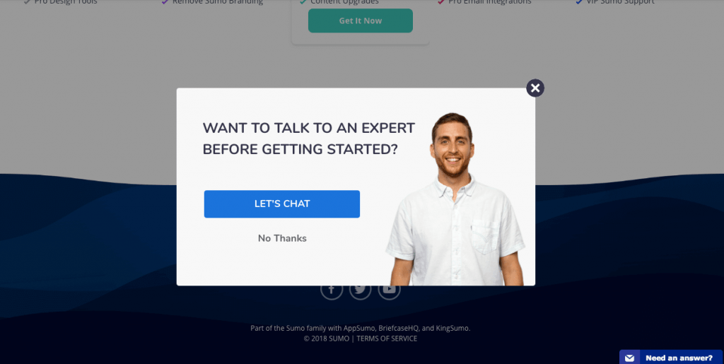
Sumo has cleverly identified that a bouncing visitor may desire a more engaged conversation with a human, not a chatbot, before converting.
This is exactly why they offer a free call with their staff when a visitor begins showing exit intent. This strategy humanizes their brand and highlights their subject degree expertise in a non-pushy and even charming way.
Final thoughts
Whenever you come across websites displaying exit intent popup, you know one thing: they are preventing their about-to-leave customers. It could be one of several communications you may develop with a potential customer, but also it could be the last.
As soon as you realize that your customers are on your way out without purchasing anything, try to stop them either with some offers or some discount. This is completely what an Exit Intent Popup needs to perform in eCommerce.
Now, a majority of the online brands are leveraging exit intent popups to boost conversions on their website, as per the above exit intent popup examples. Will you?


