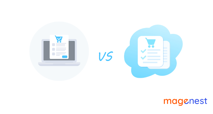
What is the difference between one-page checkout vs multi-page checkout?
As you may already know that the attention span of online customers is incredibly short, therefore it’s best to not challenge your clients’ patience.
The checkout process is one of the most critical steps among other activities in the shopping experience. Of course, it’s never easy to lead visitors to your checkout page and even if you do lead them to that stage, a lot of things may happen to prevent them from making a payment. At least you could try your best to make the checkout process as smooth as possible for your customers right from the beginning. If not, common problems in completing checkout forms such as high hidden costs, trust issues, and terribly long pages,... all can cause cart abandonment.
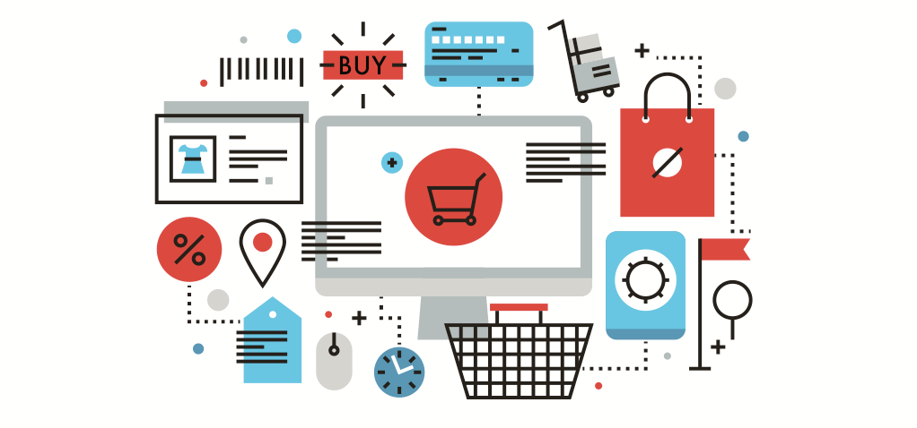
Knowing that kind of difficulty in running a business page, eCommerce professionals have been working for years to find out how to optimize the checkout page. From multi-pages checkout to one-page checkout and now, some Magento 2 stores even have used one-step checkout for their online stores to boost customers’ satisfaction in shopping on their sites but the first two methods are still the most popular.
To choose the best option for your eCommerce stores, it’s vital to make that decision based on your buyers’ shopping behaviors. You should know who your targeted customers are as well as conduct efficient A/B tests to build up your own eCommerce checkout page. There’s no specific type of checkout that suits all types of customers but finding the best optimized checkout page for your store should be under your control and absolutely possible to do, especially if you have us to help you with that in this article.
To not make you wait any longer, let’s compare one-page checkout vs multi-page checkout for eCommerce sites.
One-page Checkout
As its name can tell us, a one-page checkout will display all the features and fields of the checkout process on one single page. This includes all the information a customer needs to finish their checkout processes such as billing, shipping address, payment options, shipping options, and additional fields related.
The idea behind this method is to help customers reduce cart abandonment since they can fill in all the information required on just one page.
One-page checkout is a standard model (a default checkout page) for Magento 2 stores and compared to Magento 1, this feature of Magento 2 did make big progress in shopping optimization since all the steps are now on just one single page instead of 6 steps spreading along 6 pages like the previous version.
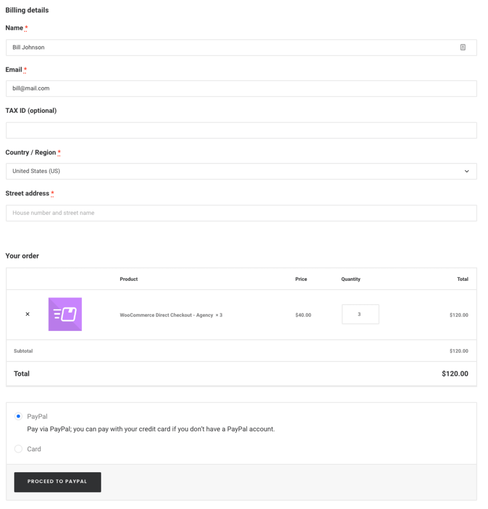
1. What are the pros of one-page checkout?
Reduce carts abandoned
Research has shown that 21% of online users tend to abandon their carts before the checkout step because the shopping site takes too long to respond and is complicated to understand. By shortening the process with all the checkout elements on one page, you can reduce the number of cards abandoned and increase the conversion rates.
Time-saving with fewer steps
There would be no need for shoppers to navigate through many different pages to preview their cart like filling in their information and paying pages and so on. Everything required for a payment process now can be done in a single step, the process of checking out will be less time-consuming than multi-page ones. Besides, customers can also update and change their information on the same screen, they don’t have to go back and forth to finish their product checkout.
Higher conversion rates
Statistics have shown that one-page checkouts are likely to increase from 10% to 20% of the conversion rates than multi-page checkouts although it also depends on the type of products you sell. However, shorter and simpler checkout pages surely can convert better and encourage buying decisions.
Easy to understand
Thanks to all the information displayed on a single page, one-page checkout will be more straightforward for customers to understand. One great advantage of a one-checkout page is that right from the beginning customers could see all the fields they need to fill in to finish their order so they know what to expect and make a suitable decision.
Although one-page checkout has some great benefits, we still need to look at its drawbacks to have a more comprehensive view.
>> Read more: What is Shopping Cart? What Should Magento 2 Merchants Know?
2. What are the cons of one-page checkout?
- Site speed
The fact that it includes too many elements on one page can increase the amount of loading time the site needs than usual. Shoppers always want to buy stuff quickly, so it’s a good idea to make sure that your checkout page not only works well but loads fast. If not, we're concerned that you may lose customers who are afraid of wasting their precious time.
- Can overwhelm customers
Note that all the billing, shipping, and payment methods appear at the same time on a single page can overwhelm your customers. That’s why it’s better to ensure you optimize the checkout page and remove all the unnecessary fields so your clients could have a better focus.
- Limited analytics
With one-page checkout, website developers will find it harder to track and analyze at which step your customers want to stop their shopping and abandon their cart, therefore, it’s also more difficult to find out the reasons and drawbacks which are used for further development later.
3. When should a business use a one-page checkout?
There’s no doubt that one-page checkout is extremely useful for digital and online products that can be downloaded online. Since users won’t have to fill in details about their address to get delivered. And fewer fields to complete mean you would have a shorter checkout process.
Besides, if a business registers for saving the data of loyal customers and returning users then one-page checkouts will be an excellent option to go for as you can save their information, allowing customers to checkout faster.
Finally, nowadays, there is an increasing number of people going shopping online. One-page checkout and fast-loading websites would be among their priorities, especially for inexpensive items they buy.
Multi-page Checkout
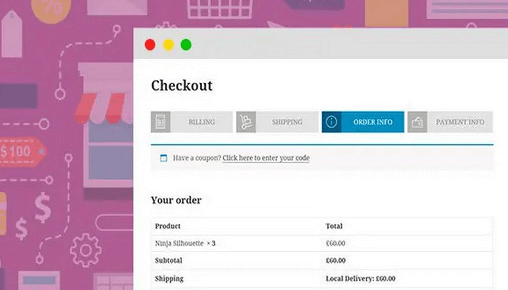
Unlike one-page checkout with all the required elements and fields on the same screen, multi-page checkout will divide the whole checkout steps into several web pages, usually from 3 to 5 pages.
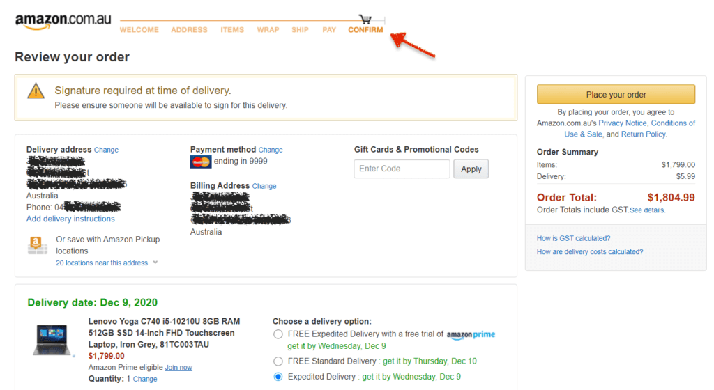
For each step, consumers will need to enter their personal information, shipping method, shipping address, payment options, and so on.
The multi-step checkout method breaks down the whole process into different pages, so they tend to be slow compared to one-page checkouts. However, many users stated that they find it more comfortable and easy to follow with multi-page checkout because they have more time to carefully check and confirm compulsory details before placing an order.
1. What are the pros of multi-page checkout?
Better analytics
Multi-page checkouts allow website developers to have a better understanding of customers’ behavior to analyze and identify at what steps customers leave them and abandon their carts. This kind of information is very valuable to make proper adjustments and improve the conversion rates of any online store.
Higher security
When the process is slower and customers are allowed to fill in their details step by step, they would likely feel more secure about buying on a website. This feeling is particularly important when shoppers are buying something expensive and worth paying attention to small details.
Cleaner layout
Since you can reduce the amount of content on each page by spreading the checkout fields into smaller steps, your checkout page certainly will be less overwhelming to customers and much cleaner also. Unlike with one-page checkouts, people would have to read a lot of important elements and they may make a mistake in the middle of filling the form.
Display progress
Some experts have shown that online customers tend to have more motivation to finish their purchase if they can see how close they are to the final step. It seems that people don’t want to leave things unfinished and go, instead, they would feel more encouraged to achieve their goal (here it would be to place their order). Luckily, by using multi-page checkout to display the progress, you can make your shoppers feel that way.
In short, a multi-page checkout often provides a clearer layout and gives customers a more secure feeling about their online shopping. But similarly to one-page checkout, this approach also has some drawbacks you should know.
2. What are the cons of multi-page checkout?
Time-consuming
Instead of finishing a checkout in one step, now customers have to complete their orders with too many small steps. It may discourage them if they are in a hurry or those who don’t have much patience may want to go to another store rather than stay at your site.
Cart abandonment
As we discussed this problem before, a long checkout process is one of the main causes of cart abandonment on eCommerce sites. Imagine every time you go to the next step, you have to load another new page again. I would be lucky if you have a stable internet connection so you don’t need to start all over again due to any unexpected incident. Multi-page checkout that contains too many steps might distract users and increase the cart abandonment rate. So, an abandoned cart email extension will help you manage your shop effectively.
Harder to change or correct details
Because each step involves different details on different pages, it's hard to correct or change information when people want to. For example, if you are about to pay but you realize there’s a mistake in your billing address, you would have to go back to fix it. This might cause frustration and the chances of cart abandonment.
3. When should a business use a multi-page checkout?
Multi-page checkout works best when you have to deal with selling expensive products that involve a more thoughtful decision. This approach enables customers to have a more secure feeling since they can double-check their details and other essential information before placing the order.
To make the best use of this, you can allow shoppers to review all the steps when they move from one step to another.
Summary: Which one to choose? One-page checkout vs multi-page checkout
Each of the two methods above has its own advantages and disadvantages, and below would be a brief summary of these checkout pages.
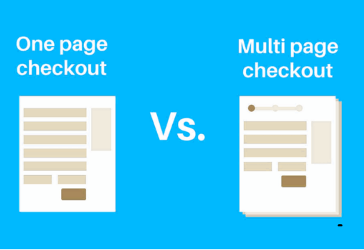
One-page checkouts have fewer steps and therefore will save a lot of time for users. Customers like this benefit so it’s usually a good way to improve conversion rates and cart abandonment. However, it can be a bit overwhelming for customers to absorb a lot of information and it’s also harder to analyze shoppers' behavior during the checkout process. But do keep in mind that this is a perfect solution for selling products that are not expensive.
On the other hand, multi-checkouts break the checkout process into several steps so it surely has a better and cleaner layout. Customers also tend to feel more secure with it and multistep checkout can provide better analytics for website development. But this also comes with a few drawbacks like more time needed to place an order, which can cause abandoned carts. Besides, changing information and details is not easy on this kind of checkout page. If you sell valuable products then this is a suitable type for your online store.
Conclusion
Now we hope you have learned that checkout is one of the most important features of any online store in this highly competitive eCommerce industry. The question of whether one-page or multi-page checkout is better still remains controversial. Even though the one-page checkout method has gained popularity in recent years, it’s certainly not a one-size-fits-all solution for all eCommerce businesses out there.
To choose the best kind of checkout page for your stores, it’s necessary to do some research about your targeted audience’s preferences, consider your budget condition, your objectives in the long term before investing in any resources. Contact us if you have any questions related to not only checkout page methods, but also other eCommerce elements to boost the productivity of your online stores.


