Checkout is a process that customers must go through when they want to make an order. It is the last step to complete a purchase. This includes filling in the shipping information, payment information, coupon codes (if any), confirming the order and making the payment integration in Magento 2. So definitely, you do not want to lose your customers at the checkout page.
In this blog, we will show you how to improve your checkout that prevents customers from abandoning their shopping carts.
One-page checkout vs Multi-page checkout: which one is better?
The idea that one-page checkout is better than multi-page checkout is somehow common. Do one-page checkout actually reduce the rate of abandoned carts?
According to recent A/B tests to compare the effectiveness between two types of checkout, it is discovered that one-page checkout doesn’t help you sell more.
The number of pages doesn’t matter much as you thought. However, each type of checkout still has some typical advantages that merchants should know to optimize their stores.
One-page Checkout
By putting all the checkout steps into one single page, store owners can trick their customers that they can save a lot of time. No need for waiting for numerous pages to loading. No need for turning back to check whether your information is correct or not. Moreover, customers will not be distracted during loading pages process.
Who should choose one-page checkout? It is the most suitable when you sell convenient goods and low-price products for young and technology savvy customers. Merchants whose customers are mobile shopper should also consider one-page checkout.
Multi-page Checkout
Because the checkout process is divided into many small steps, it minimizes the mistakes that your customers can make. When reviewing the abandoned cart rate, you can know exactly which step they often drop out and investigate the causes behind.
Multistep checkout would be perfect for stores with high-end products. If your target customers are old and low-tech people, this type of checkout will be the ideal option.
Improve your checkout for better conversion rates
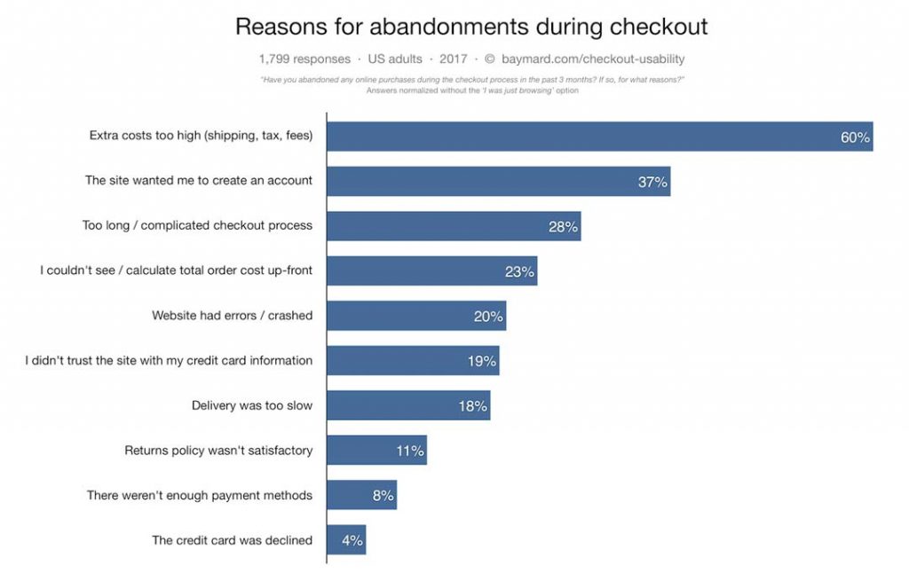
To reduce all the problems from the above chart, there are several things that you can do:
1. Add a progress bar
The progress bar provides information about the checkout process: How many stages customers must go through and which stage they are in.
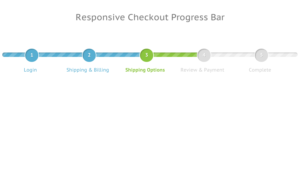
It gives customers the feeling that everything is on a smooth run and they can control it well. Imagine when you’re checkout and keep filling in tons of forms, one to another, you think maybe this is the last step but then after that, another unexpected page appears. It’s so annoying, isn’t it? The result is easily predicted: your customers will give up entirely.
If your website is built with multi-page checkout, it’s indispensable to have this bar.
2. Add multiple checkout buttons
In order to make a purchase, visitors need to access your checkout page in a seamless way. Imagine that your shoppers add several items to their carts and start looking for a checkout button to complete the order but they can’t find out it because the button is unclear to their view. Customers are not patient. They will leave your site quickly.
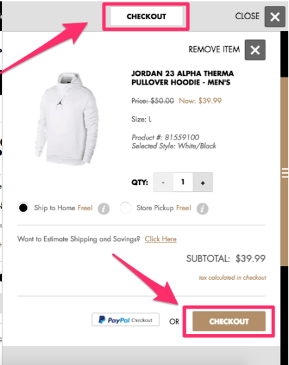
We highly recommend you to put checkout buttons on both the top and the bottom of the screen, which increase the possibility that your customers will see and click on to navigate to the checkout page. Also, the checkout buttons should be placed on the right side of your page so that customers can continue their shopping on the left.
3. Speed up loading times
People expect fast experience in online shopping so if you let your customers wait too long, they will leave. You should check some causes of slow checkout in Magento 2 as the following:
- Lots of JS error issues.
- Much static content such as images, CSS files.
- Complex checkout pages.
- Incompatible third-party modules.
- Low quality of hosting, VPS, server.
4. Create a checkout option for visitors
Lots of merchants try to force customers to create an account in order to continue their purchases. But keep in mind that creating customer profiles is not a compulsory task to complete order. So why you have to make it so hard?
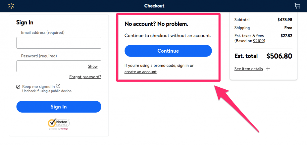
Registration should be made as an optional choice. Some shoppers just want to make a one-off purchase so they do not want to waste their time on account register. So they just quit if they have to create an account to continue the purchase because it’s so time-consuming. Hence, offer a guest checkout option will bring you more orders.
You can encourage your customers to create an account by giving them discounts towards their next orders.
5. Unclear shipping fees and return policy
Everyone enjoys free shipping. If you cannot cover this cost, at least make a clear notification on your site. Let your customers know the shipping costs early in the checkout process. Unexpected delivery cost is the leading cause of checkout quitting. Don’t hide it!
6. Offer several payment methods

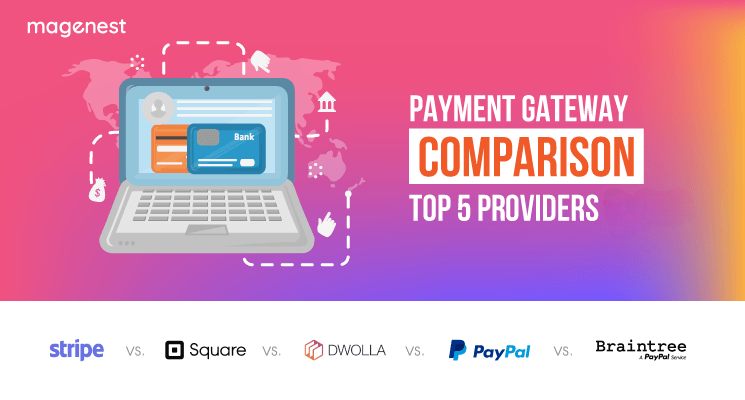
Those who don’t have a Paypal account may be not interested in checkout with Paypal. So offer many payment options as much as possible. You will never want to lose your customers just because your website does not support the payment method they want to use.
You should consider these Magento extensions to integrate popular payment gateways to your eCommerce site: Magento 2 Stripe Payment Gateway, Magento 2 Moneris Payment Gateway, Magento 2 Opayo (Sage Pay) Integration, Magento 2 Paya Integration, and Magento 2 Alipay Cross - Border Payment Gateway.
7. Low-security level
It is the biggest issue that both merchants and shoppers care about during the online payment process. To make your customers feel secure, you can add trust elements to your checkout page. Placing seals like TRUSTe or VeriSign Secured can help to increase conversion rates. This tip is really useful for spammy industries such as finance and health.
8. Poor design
All text, images, and other information need to be organized in a simple and attractive way. Don’t mix all together like a mess. You need to focus on how your website will display and function on the mobile version. It’s important to make it easy to shop on mobile devices when the number of sales from mobile users has been increasing remarkably.
Conclusion
Checkout optimization contributes to a better customer experience that can ultimately lead to a significant conversion increase. I hope that this blog can provide you some useful information that helps you to improve your checkout page.
Feel free to leave your comments below.


